We use cookies to enhance your browsing experience, serve personalized content, and analyze our traffic.
By clicking "Accept All", you consent to our use of cookies. See our
Privacy Policy
for more information.
Prerequisites: Before running the code examples in this tutorial, make sure you have Python and Jupyter notebooks properly set up. If you haven't configured your development environment yet, check out our complete setup guide for VS Code, PyCharm, Jupyter, and Colab.
After loading and analyzing data with NumPy and Pandas, the next step is visualization—transforming numbers into visual insights that communicate patterns, trends, and anomalies.
Figure 1: Chart type selection guide — choosing the right visualization based on your data and analysis goal
Why Visualization Matters: "A picture is worth a thousand rows." Humans process visual information 60,000x faster than text. Good visualizations reveal insights that would take hours to discover in raw data.
Matplotlib: Low-level, highly customizable plotting library (the foundation)
Seaborn: High-level interface built on Matplotlib for statistical graphics
Other tools: Plotly (interactive), Bokeh (web), Altair (declarative)
# Installation
pip install matplotlib seaborn

# Import convention
import matplotlib.pyplot as plt
import seaborn as sns
import numpy as np
import pandas as pd
Matplotlib Fundamentals
Matplotlib provides complete control over every element of a plot. It has two interfaces:
pyplot (MATLAB-style): Quick plotting with plt.plot()
Object-oriented (OO): Explicit figure and axes objects (recommended)
Figure 2: Anatomy of a Matplotlib figure — key components including figure, axes, labels, title, legend, and tick marks
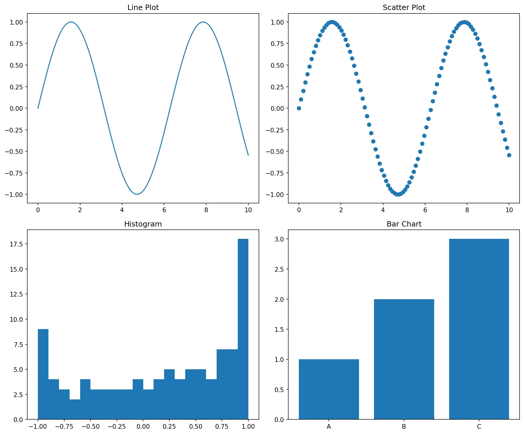
Basic Plots
import matplotlib.pyplot as plt
import numpy as np
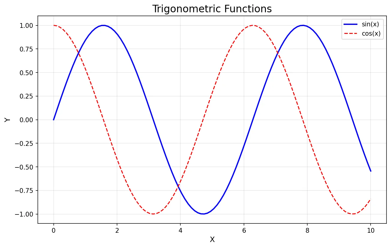
# Line plot
x = np.linspace(0, 10, 100)
y = np.sin(x)
plt.plot(x, y)
plt.title('Sine Wave')
plt.xlabel('X axis')
plt.ylabel('Y axis')
plt.grid(True)
plt.show()
# Scatter plot
plt.scatter(x, y, alpha=0.5)
plt.show()
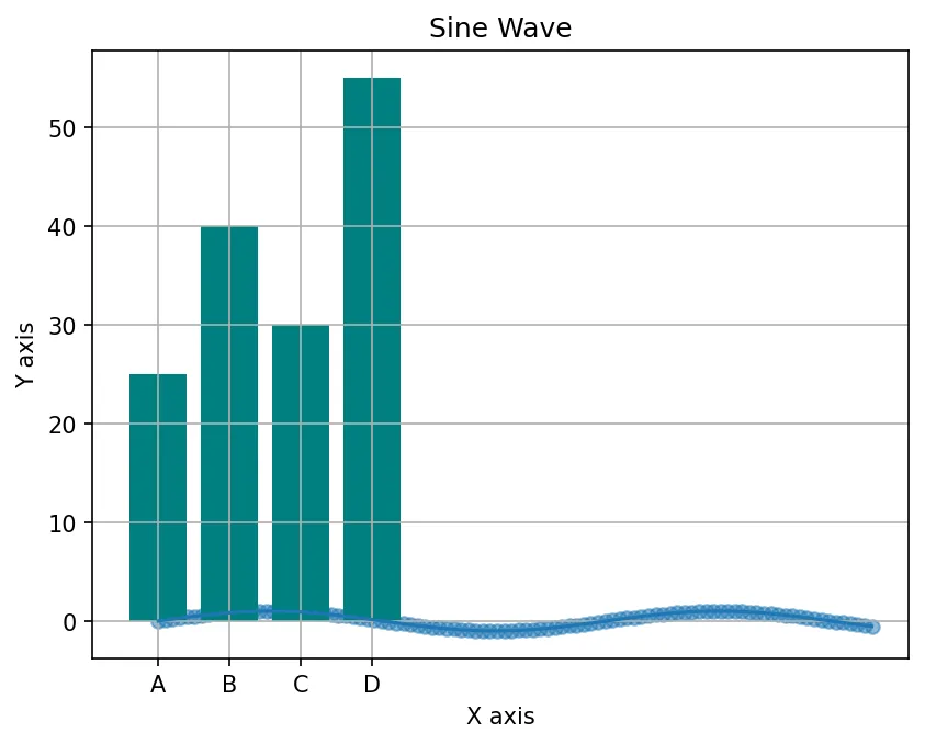
# Bar chart
categories = ['A', 'B', 'C', 'D']
values = [25, 40, 30, 55]
plt.bar(categories, values, color='teal')
plt.show()
Figure: Sine Wave
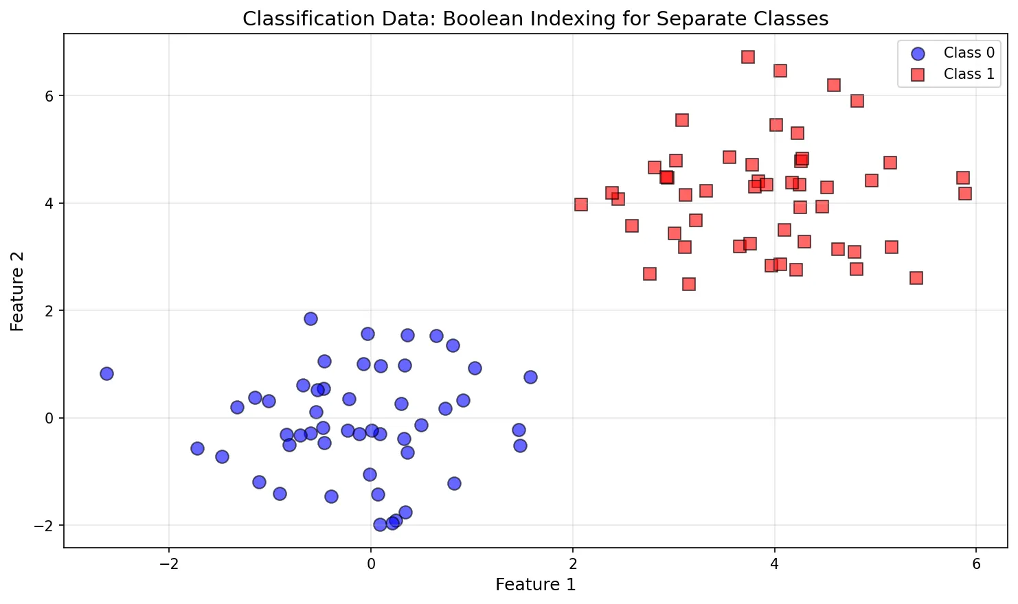
Scatter Plots with Boolean Indexing
One of the most powerful techniques for visualizing classified data is using boolean indexing to plot different groups with different colors and markers. This is essential for machine learning visualization.
Why This Matters: Boolean indexing allows you to separate data by class/category and plot each group independently—critical for visualizing classification problems, clustering results, and exploratory data analysis.
Basic Pattern: Plotting by Class
The syntax X[y==0, 0] selects rows where y==0, then column 0 (first feature):
import matplotlib.pyplot as plt
import numpy as np

# Generate sample classification data
np.random.seed(42)
class_0 = np.random.randn(50, 2) + np.array([0, 0])    # Cluster around (0,0)
class_1 = np.random.randn(50, 2) + np.array([4, 4])    # Cluster around (4,4)

# Combine into single dataset
X = np.vstack([class_0, class_1])  # Shape: (100, 2)
y = np.array([0]*50 + [1]*50)       # Labels: [0,0,...,0,1,1,...,1]

print("X shape:", X.shape)  # (100, 2)
print("y shape:", y.shape)  # (100,)
print("Sample X:", X[:3])   # First 3 rows
print("Sample y:", y[:3])   # First 3 labels
Step-by-Step: Boolean Masking
import matplotlib.pyplot as plt
import numpy as np

# Sample data (from previous example)
np.random.seed(42)
class_0 = np.random.randn(50, 2) + np.array([0, 0])
class_1 = np.random.randn(50, 2) + np.array([4, 4])
X = np.vstack([class_0, class_1])
y = np.array([0]*50 + [1]*50)

# Step 1: Create boolean masks
mask_class_0 = (y == 0)  # [True, True, ..., False, False]
mask_class_1 = (y == 1)  # [False, False, ..., True, True]

print("Class 0 mask:", mask_class_0[:5])  # [True, True, True, True, True]
print("Class 1 mask:", mask_class_1[:5])  # [False, False, False, False, False]

# Step 2: Apply masks to select data
class_0_x = X[mask_class_0, 0]  # X-coordinates for class 0
class_0_y = X[mask_class_0, 1]  # Y-coordinates for class 0
class_1_x = X[mask_class_1, 0]  # X-coordinates for class 1
class_1_y = X[mask_class_1, 1]  # Y-coordinates for class 1

print("Class 0 X coords:", class_0_x[:3])
print("Class 0 Y coords:", class_0_y[:3])
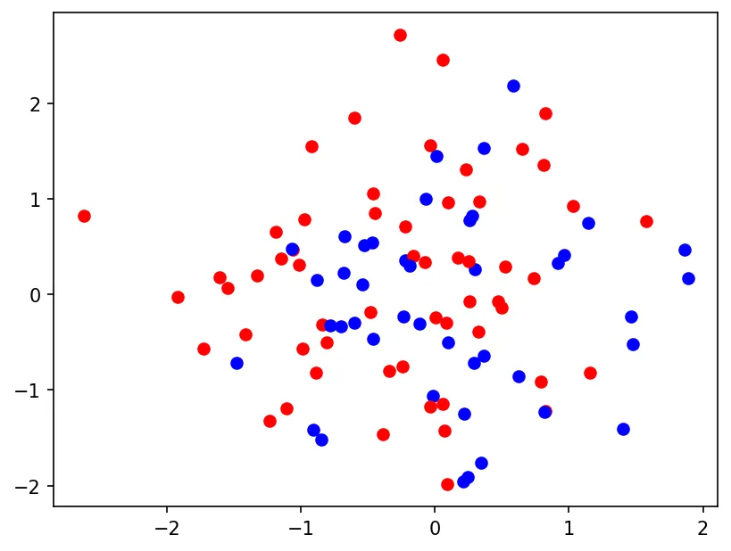
Visualization: Separate Colors per Class
import matplotlib.pyplot as plt
import numpy as np

# Sample data (from previous examples)
np.random.seed(42)
class_0 = np.random.randn(50, 2) + np.array([0, 0])
class_1 = np.random.randn(50, 2) + np.array([4, 4])
X = np.vstack([class_0, class_1])
y = np.array([0]*50 + [1]*50)

# Plot each class separately with boolean indexing
plt.figure(figsize=(10, 6))

# Class 0: Blue circles
plt.scatter(X[y==0, 0], X[y==0, 1],  # Boolean indexing: rows where y==0, columns 0 & 1
            label='Class 0',
            alpha=0.6,
            edgecolors='k',
            s=80,
            c='blue')

# Class 1: Red squares
plt.scatter(X[y==1, 0], X[y==1, 1],  # Boolean indexing: rows where y==1, columns 0 & 1
            label='Class 1',
            alpha=0.6,
            edgecolors='k',
            s=80,
            c='red',
            marker='s')  # Square marker

plt.title('Classification Data: Boolean Indexing for Separate Classes', fontsize=14)
plt.xlabel('Feature 1', fontsize=12)
plt.ylabel('Feature 2', fontsize=12)
plt.legend()
plt.grid(True, alpha=0.3)
plt.tight_layout()
plt.show()
Figure: Classification Data: Boolean Indexing for Separate Classes
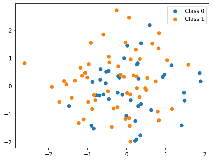
import matplotlib.pyplot as plt
import numpy as np

np.random.seed(42)
X = np.random.randn(100, 2)
y = np.random.randint(0, 2, 100)

# Boolean indexing: ONE operation per class
plt.scatter(X[y==0, 0], X[y==0, 1], label='Class 0')
plt.scatter(X[y==1, 0], X[y==1, 1], label='Class 1')
plt.legend()
plt.show()
Figure: Visualization Visualization
Loop Approach (Slow, Avoid):
import matplotlib.pyplot as plt
import numpy as np

np.random.seed(42)
X = np.random.randn(100, 2)
y = np.random.randint(0, 2, 100)

# Bad: Loop through every point (100 scatter() calls!)
for i in range(len(y)):
    if y[i] == 0:
        plt.scatter(X[i, 0], X[i, 1], c='blue')
    else:
        plt.scatter(X[i, 0], X[i, 1], c='red')
plt.show()
Figure: Visualization Visualization
Boolean indexing is 100x faster for large datasets and produces cleaner code. Always prefer vectorized operations!
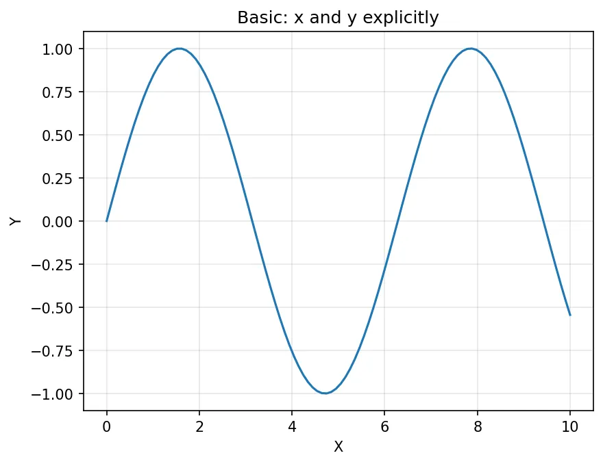
Understanding plt.plot() Parameters
The plot() function is highly flexible with many parameters for customization:
# Complete signature:
# plot([x], y, [fmt], *, data=None, **kwargs)

import matplotlib.pyplot as plt
import numpy as np

x = np.linspace(0, 10, 100)
y = np.sin(x)

# Basic usage - x and y explicitly
plt.plot(x, y)
plt.title('Basic: x and y explicitly')
plt.xlabel('X')
plt.ylabel('Y')
plt.grid(True, alpha=0.3)
plt.show()
Figure: Basic: x and y explicitly
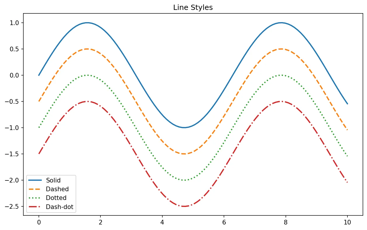
import matplotlib.pyplot as plt
import numpy as np
x = np.linspace(0, 10, 100)
y = np.sin(x)
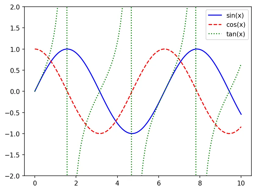
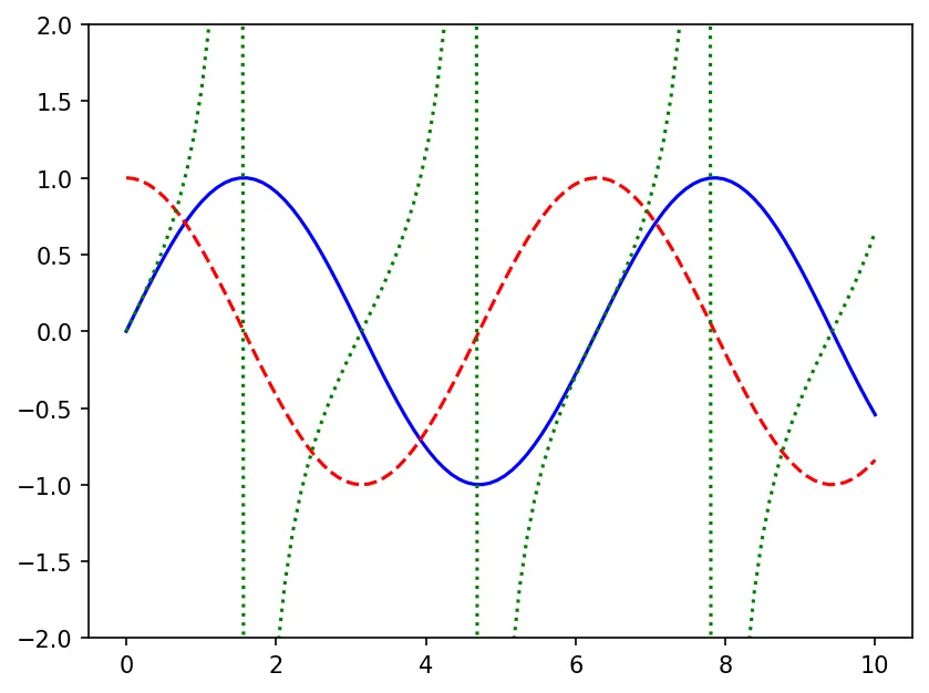
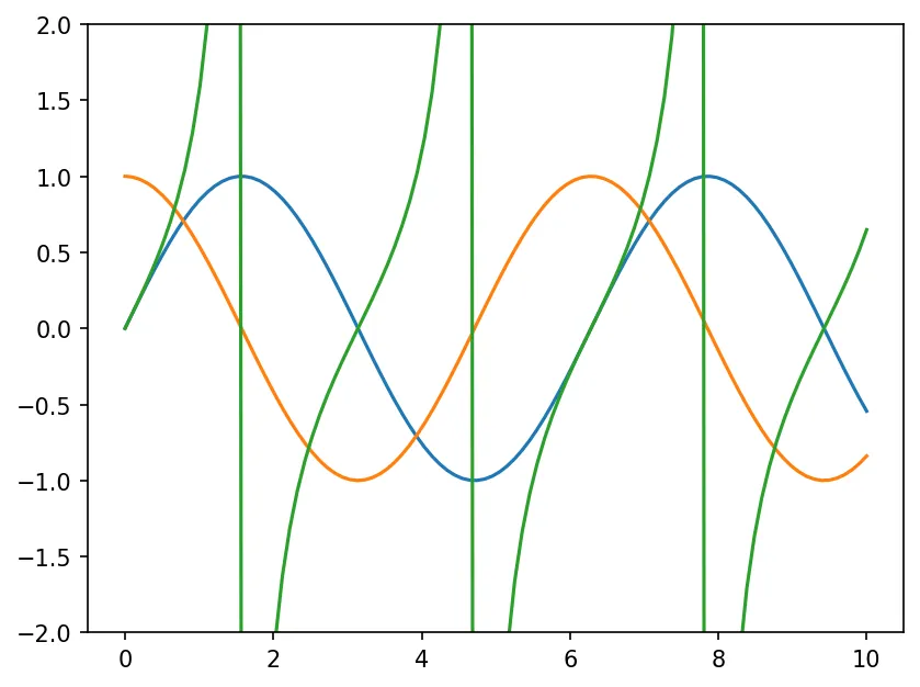
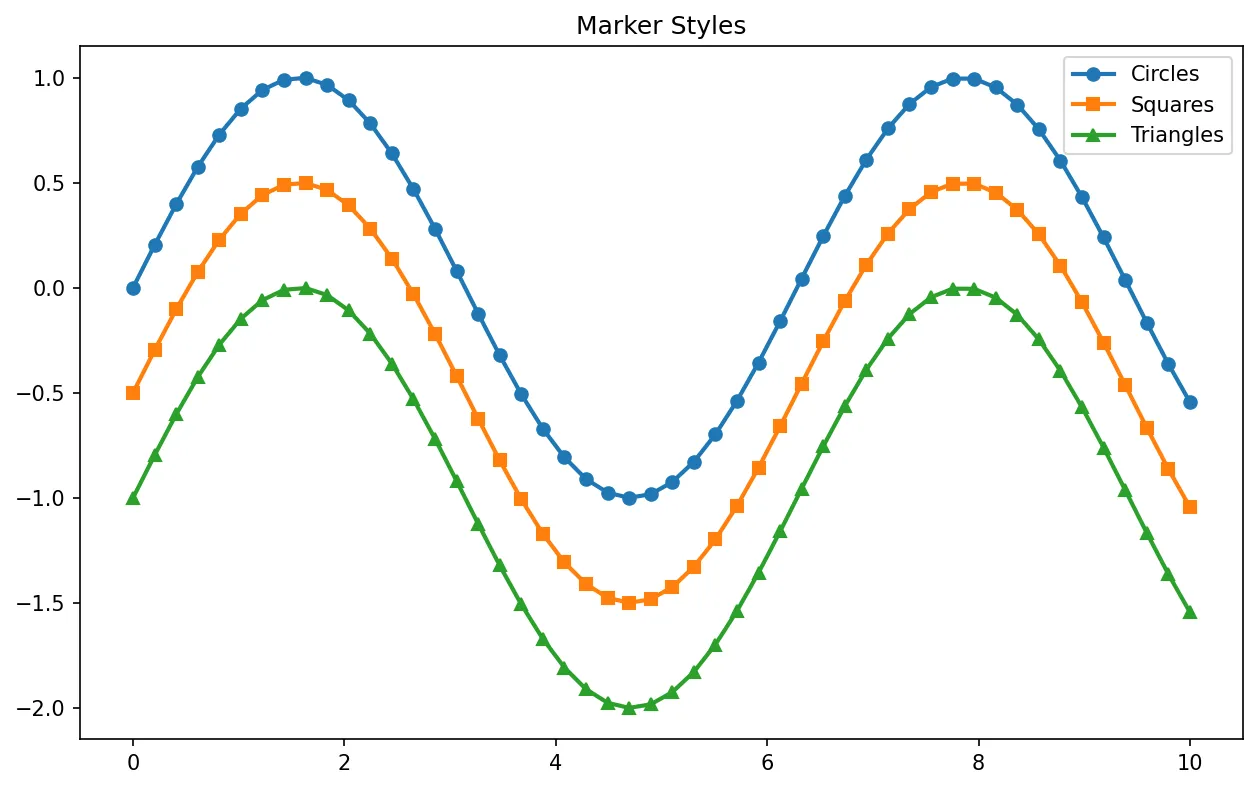
# Format strings [marker][line][color]
plt.plot(x, y, 'ro-', label='red circles, solid')
plt.plot(x, y - 0.5, 'g^--', label='green triangles, dashed')
plt.plot(x, y - 1, 'bs:', label='blue squares, dotted')
plt.title('Format Strings: [marker][line][color]')
plt.xlabel('X')
plt.ylabel('Y')
plt.legend()
plt.grid(True, alpha=0.3)
plt.show()
Figure: Format Strings: [marker][line][color]
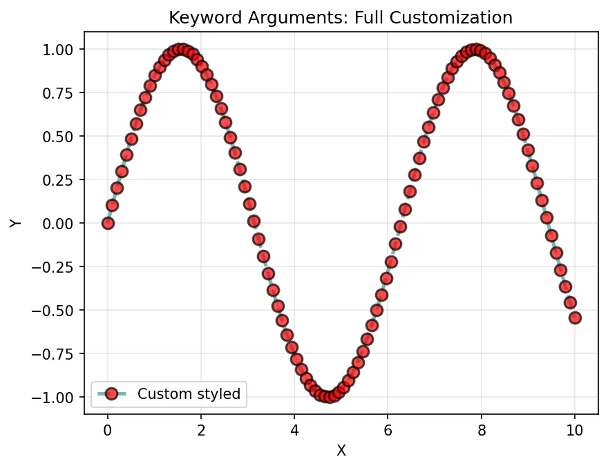
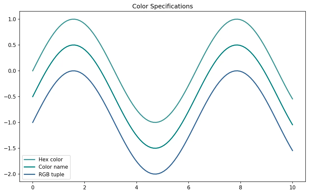
import matplotlib.pyplot as plt
import numpy as np

x = np.linspace(0, 10, 100)
y = np.sin(x)

# Keyword arguments (full customization)
plt.plot(x, y,
         color='#3B9797',           # Hex color
         linestyle='--',            # Dashed line
         linewidth=2.5,             # Line thickness
         marker='o',                # Circle markers
         markersize=8,              # Marker size
         markerfacecolor='red',     # Marker fill color
         markeredgecolor='black',   # Marker edge color
         markeredgewidth=1.5,       # Marker edge thickness
         alpha=0.7,                 # Transparency (0-1)
         label='Custom styled')     # Legend label
plt.title('Keyword Arguments: Full Customization')
plt.xlabel('X')
plt.ylabel('Y')
plt.legend()
plt.grid(True, alpha=0.3)
plt.show()
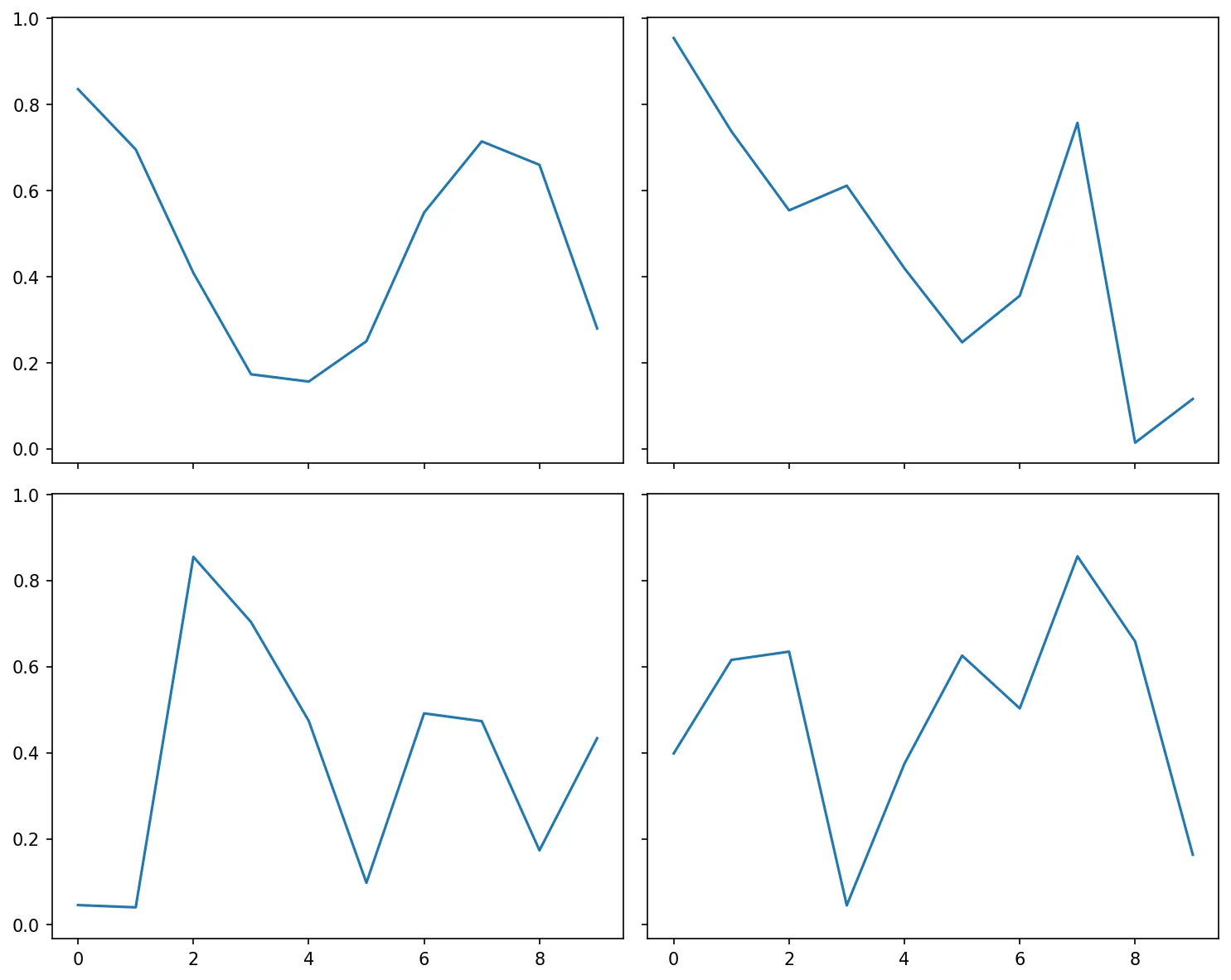
import matplotlib.pyplot as plt
import numpy as np

# Share x-axis across all subplots (aligned zoom)
fig, axes = plt.subplots(2, 2, sharex=True, sharey=True, figsize=(10, 8))

# When shared, only bottom/leftmost labels show
for ax in axes.flat:
    ax.plot(np.random.rand(10))
plt.tight_layout()
plt.show()
Figure: Visualization Visualization
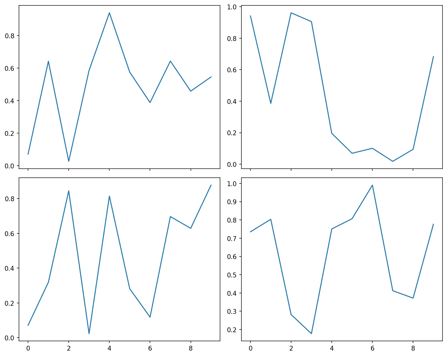
import matplotlib.pyplot as plt
import numpy as np

# Share by column (x-axis shared within each column)
fig, axes = plt.subplots(2, 2, sharex='col', figsize=(10, 8))
for ax in axes.flat:
    ax.plot(np.random.rand(10))
plt.tight_layout()
plt.show()
Figure: Visualization Visualization
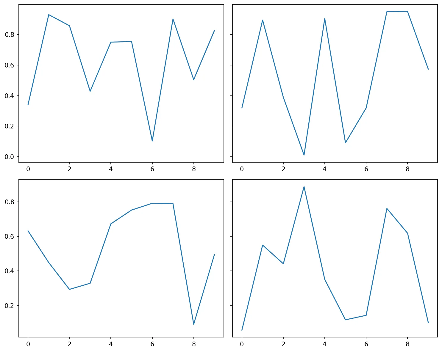
import matplotlib.pyplot as plt
import numpy as np

# Share by row (y-axis shared within each row)
fig, axes = plt.subplots(2, 2, sharey='row', figsize=(10, 8))
for ax in axes.flat:
    ax.plot(np.random.rand(10))
plt.tight_layout()
plt.show()
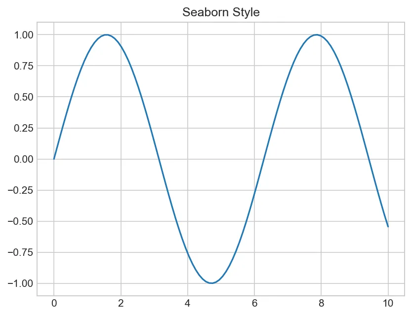
import matplotlib.pyplot as plt
import numpy as np

x = np.linspace(0, 10, 100)
y = np.sin(x)

# Apply style globally
plt.style.use('seaborn-v0_8-whitegrid')
plt.plot(x, y)
plt.title('Seaborn Style')
plt.show()
Figure: Seaborn Style
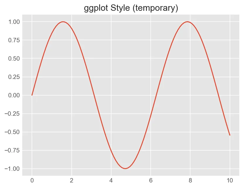
import matplotlib.pyplot as plt
import numpy as np

x = np.linspace(0, 10, 100)
y = np.sin(x)

# Temporarily use style (context manager)
with plt.style.context('ggplot'):
    plt.plot(x, y)
    plt.title('ggplot Style (temporary)')
    plt.show()
Figure: ggplot Style (temporary)
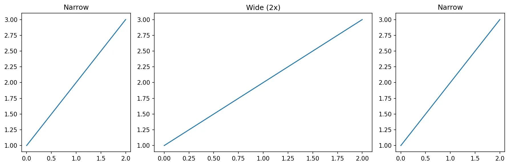
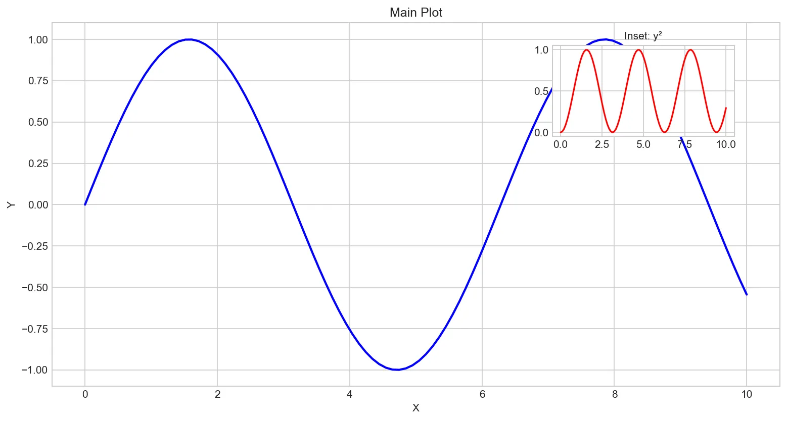
Figure-Level Customization
import matplotlib.pyplot as plt
import numpy as np

x = np.linspace(0, 10, 100)
y = np.sin(x)

# Create figure with custom size and DPI
fig = plt.figure(figsize=(12, 6), dpi=100, facecolor='white')

# Add subplot with specific position [left, bottom, width, height]
ax1 = fig.add_axes([0.1, 0.1, 0.8, 0.8])  # Main axes
ax2 = fig.add_axes([0.65, 0.65, 0.2, 0.2])  # Inset axes

ax1.plot(x, y, 'b-', linewidth=2)
ax1.set_title('Main Plot')
ax1.set_xlabel('X')
ax1.set_ylabel('Y')

ax2.plot(x, y**2, 'r-', linewidth=1.5)
ax2.set_title('Inset: y²', fontsize=10)

plt.show()
Figure: Main Plot
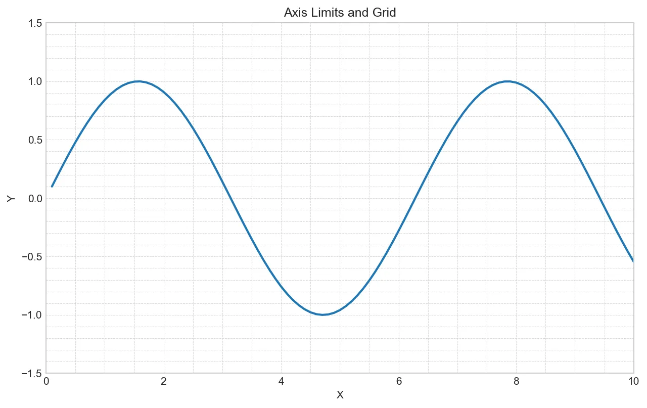
Axis Control
import matplotlib.pyplot as plt
import numpy as np

x = np.linspace(0.1, 10, 100)
y = np.sin(x)

fig, ax = plt.subplots(figsize=(10, 6))
ax.plot(x, y, linewidth=2)

# Set axis limits
ax.set_xlim(0, 10)
ax.set_ylim(-1.5, 1.5)

# Grid customization
ax.grid(True, which='both', linestyle='--', linewidth=0.5, alpha=0.7)
ax.minorticks_on()  # Enable minor ticks

ax.set_title('Axis Limits and Grid')
ax.set_xlabel('X')
ax.set_ylabel('Y')
plt.show()
Figure: Axis Limits and Grid
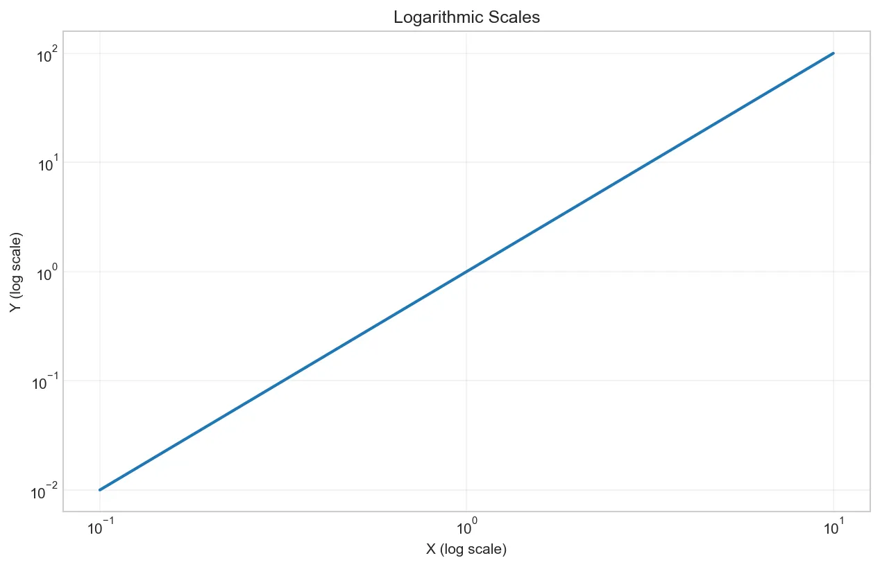
import matplotlib.pyplot as plt
import numpy as np

x = np.linspace(0.1, 10, 100)
y = x**2

fig, ax = plt.subplots(figsize=(10, 6))
ax.plot(x, y, linewidth=2)

# Set axis scales
ax.set_xscale('log')    # Logarithmic x-axis
ax.set_yscale('log')    # Logarithmic y-axis

ax.set_title('Logarithmic Scales')
ax.set_xlabel('X (log scale)')
ax.set_ylabel('Y (log scale)')
ax.grid(True, alpha=0.3)
plt.show()
Figure: Logarithmic Scales
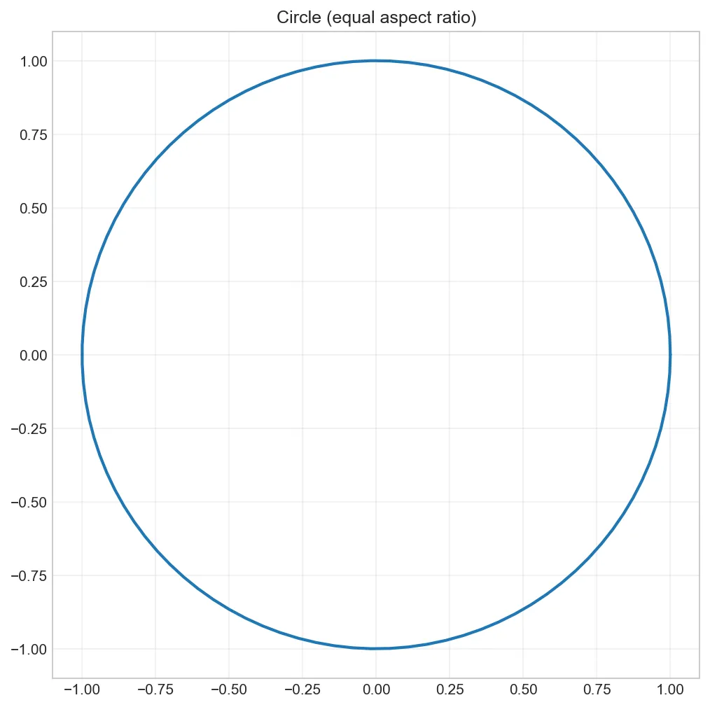
import matplotlib.pyplot as plt
import numpy as np

theta = np.linspace(0, 2*np.pi, 100)
x = np.cos(theta)
y = np.sin(theta)

fig, ax = plt.subplots(figsize=(8, 8))
ax.plot(x, y, linewidth=2)

# Equal aspect ratio for circle
ax.set_aspect('equal')
ax.set_title('Circle (equal aspect ratio)')
ax.grid(True, alpha=0.3)
plt.show()
Figure: Circle (equal aspect ratio)
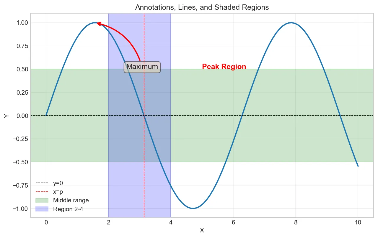
Annotations and Text
import matplotlib.pyplot as plt
import numpy as np

x = np.linspace(0, 10, 100)
y = np.sin(x)

fig, ax = plt.subplots(figsize=(10, 6))
ax.plot(x, y, linewidth=2)

# Add text at specific coordinates
ax.text(5, 0.5, 'Peak Region', fontsize=12, color='red', fontweight='bold')

# Add annotation with arrow
ax.annotate('Maximum',
            xy=(np.pi/2, 1),           # Point to annotate
            xytext=(np.pi/2 + 1, 0.5), # Text location
            arrowprops=dict(arrowstyle='->',
                           connectionstyle='arc3,rad=0.3',
                           color='red', lw=2),
            fontsize=12,
            bbox=dict(boxstyle='round', facecolor='wheat', alpha=0.5))

# Add horizontal/vertical lines
ax.axhline(y=0, color='k', linestyle='--', linewidth=0.8, label='y=0')
ax.axvline(x=np.pi, color='r', linestyle='--', linewidth=0.8, label='x=p')

# Shade regions
ax.axhspan(-0.5, 0.5, alpha=0.2, color='green', label='Middle range')
ax.axvspan(2, 4, alpha=0.2, color='blue', label='Region 2-4')

ax.set_title('Annotations, Lines, and Shaded Regions')
ax.set_xlabel('X')
ax.set_ylabel('Y')
ax.legend()
ax.grid(True, alpha=0.3)
plt.show()
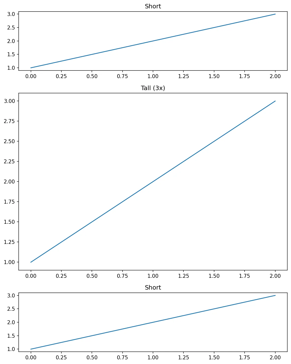
Exercise 1 (Beginner): Create a 2x2 grid of subplots. Plot sine, cosine, exponential, and logarithm functions. Add titles and labels to each subplot.
Exercise 2 (Beginner): Create subplots with different sizes: one large plot and three smaller plots. Use width_ratios or height_ratios. Apply a style.
Exercise 3 (Intermediate): Create 4 subplots with sharex and sharey. Explain how shared axes simplify zooming/panning. Create both row-wise and column-wise sharing.
Exercise 4 (Intermediate): Create a figure with custom colors, line styles, markers. Apply alpha transparency. Create custom colormaps and legends.
Challenge (Advanced): Create an inset plot (subplot within subplot). Use GridSpec for complex layouts. Customize every element (spines, ticks, labels).
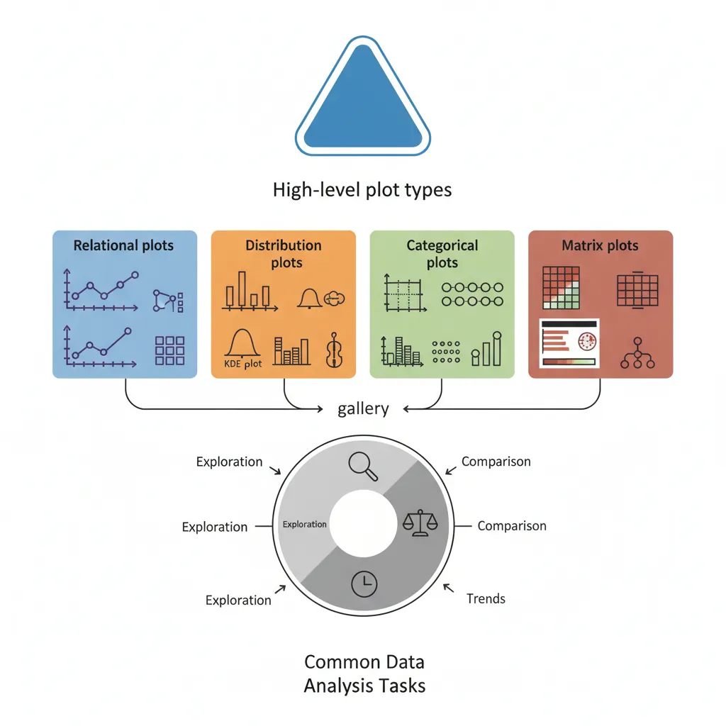
Seaborn: Statistical Graphics
Seaborn builds on Matplotlib, providing beautiful defaults and high-level functions for statistical visualizations. It integrates seamlessly with Pandas DataFrames.
Figure 3: Seaborn statistical graphics gallery — high-level plot types for common data analysis tasks
import seaborn as sns

# Set seaborn theme
sns.set_theme(style='whitegrid')

# Load sample dataset
tips = sns.load_dataset('tips')
print(tips.head())
#    total_bill   tip     sex smoker  day    time  size
# 0       16.99  1.01  Female     No  Sun  Dinner     2
# 1       10.34  1.66    Male     No  Sun  Dinner     3
# ...
Why Seaborn?
✅ Beautiful defaults (colors, fonts, spacing)
✅ Built for Pandas DataFrames (column names as labels)
✅ Statistical visualizations in one line
✅ Automatic legends and color schemes
Seaborn Datasets: Load and Explore
Seaborn provides built-in sample datasets perfect for learning and testing visualizations:
import seaborn as sns

# Get list of all available datasets
available_datasets = sns.get_dataset_names()
print("Available datasets:")
print(available_datasets)
# ['anagrams', 'anagrams_long', 'answer_keys', 'attention', 'brain_networks',
#  'car_crashes', 'diamonds', 'dots', 'dowjones', 'exercise', 'flights',
#  'fmri', 'gammas', 'geyser', 'glue', 'healthexp', 'iris', 'penguins', 'planets',
#  'taxis', 'titanic', 'tips', ...]
import seaborn as sns
import pandas as pd

# Load a specific dataset
iris = sns.load_dataset('iris')
print(iris.info())
print("\nDataset shape:", iris.shape)
print(iris.describe())

# Another popular dataset
titanic = sns.load_dataset('titanic')
print("Titanic columns:", titanic.columns.tolist())
print("Titanic shape:", titanic.shape)
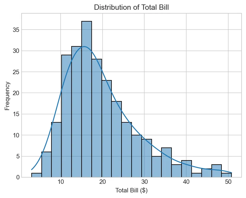
import matplotlib.pyplot as plt
import seaborn as sns

# Load sample dataset
tips = sns.load_dataset('tips')

# Histogram with KDE overlay
sns.histplot(tips['total_bill'], bins=20, kde=True)
plt.title('Distribution of Total Bill')
plt.xlabel('Total Bill ($)')
plt.ylabel('Frequency')
plt.show()
Figure: Distribution of Total Bill
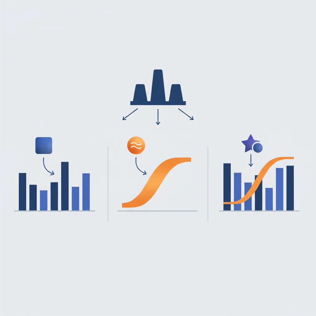
KDE (Kernel Density Estimate) Plots - Detailed Parameters
kdeplot() creates smooth probability density curves. Key parameters for customization:
Figure 4: Distribution visualization methods — histogram (discrete bins), KDE (smooth density curve), and combined overlay
import matplotlib.pyplot as plt
import seaborn as sns
tips = sns.load_dataset('tips')
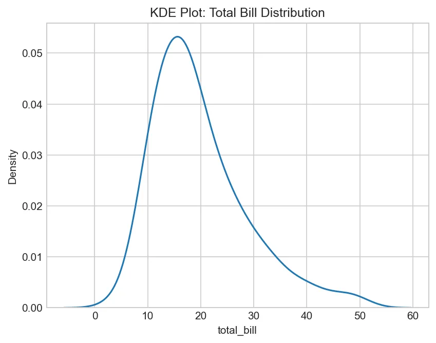
# Basic KDE plot
sns.kdeplot(data=tips, x='total_bill')
plt.title('KDE Plot: Total Bill Distribution')
plt.show()
Figure: KDE Plot: Total Bill Distribution
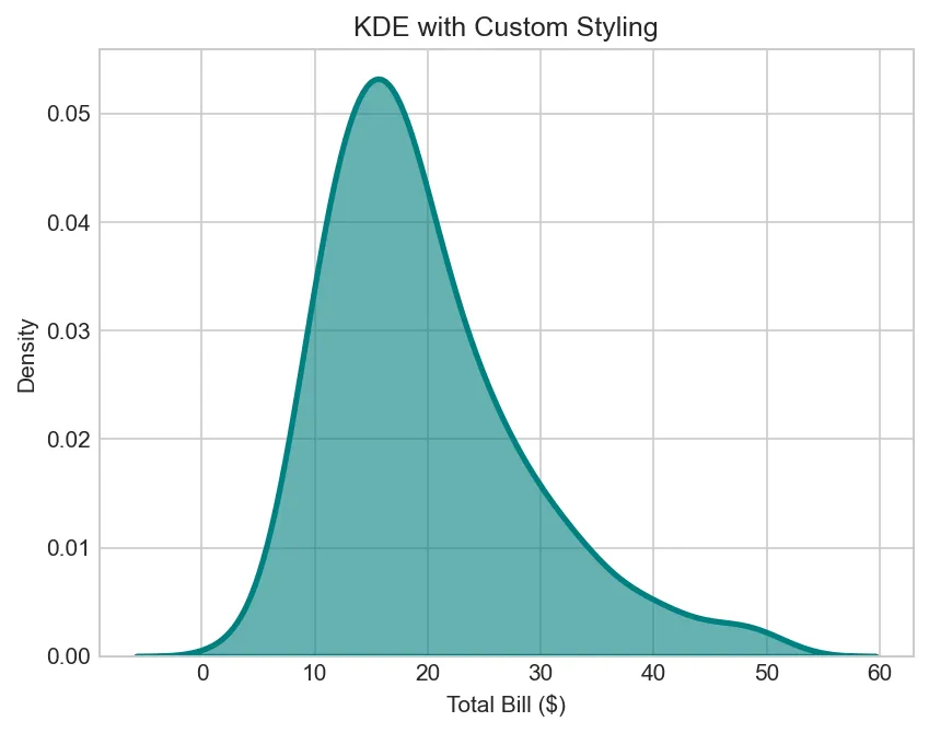
import matplotlib.pyplot as plt
import seaborn as sns

tips = sns.load_dataset('tips')

# KDE with filled area and custom color
sns.kdeplot(data=tips, x='total_bill',
            fill=True,              # Fill under curve (shade=True in older versions)
            color='teal',           # Line/fill color
            linewidth=2.5,          # Line thickness
            alpha=0.6)              # Transparency
plt.title('KDE with Custom Styling')
plt.xlabel('Total Bill ($)')
plt.show()
Figure: KDE with Custom Styling
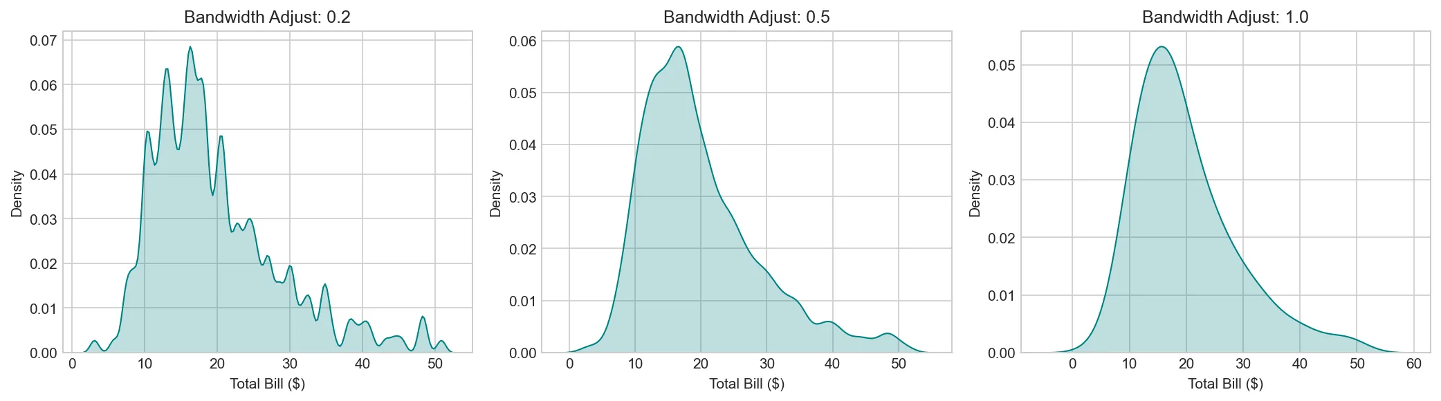
import matplotlib.pyplot as plt
import seaborn as sns

tips = sns.load_dataset('tips')

# Bandwidth adjustment (controls smoothness)
fig, axes = plt.subplots(1, 3, figsize=(14, 4))

for ax, bw in zip(axes, [0.2, 0.5, 1.0]):
    sns.kdeplot(data=tips, x='total_bill', bw_adjust=bw,
                fill=True, color='teal', ax=ax)
    ax.set_title(f'Bandwidth Adjust: {bw}')
    ax.set_xlabel('Total Bill ($)')

plt.tight_layout()
plt.show()
Figure: Visualization Visualization
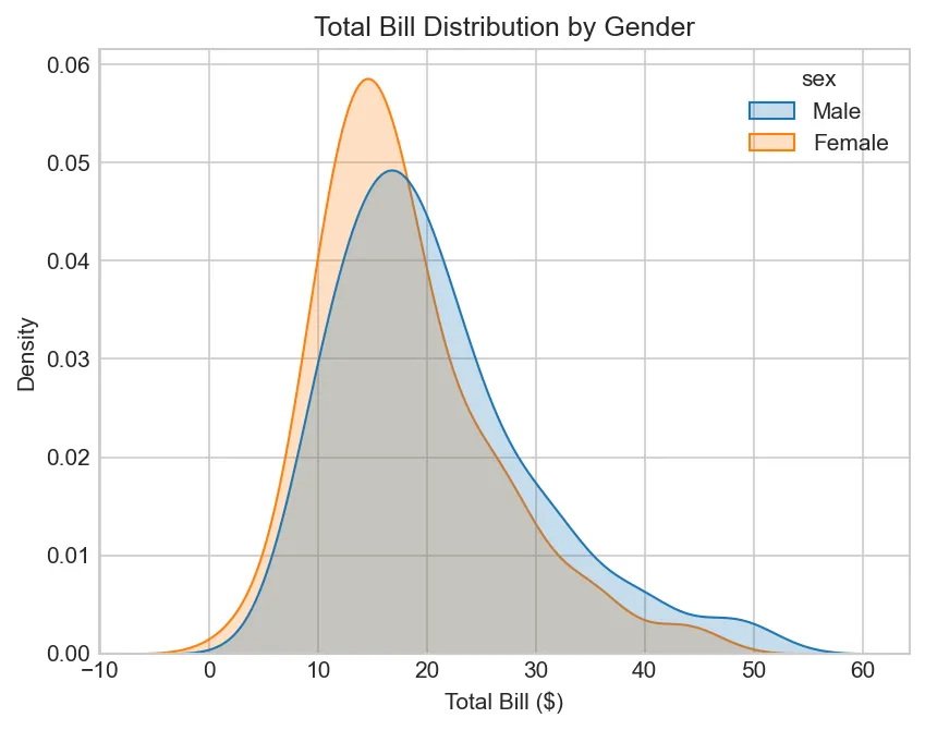
import matplotlib.pyplot as plt
import seaborn as sns

tips = sns.load_dataset('tips')

# Multiple distributions by category (hue parameter)
sns.kdeplot(data=tips, x='total_bill', hue='sex',
            fill=True,              # Fill curves
            common_norm=False)      # Each hue normalized separately
plt.title('Total Bill Distribution by Gender')
plt.xlabel('Total Bill ($)')
plt.show()
Figure: Total Bill Distribution by Gender
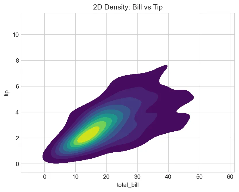
import matplotlib.pyplot as plt
import seaborn as sns

tips = sns.load_dataset('tips')

# 2D KDE (bivariate density)
sns.kdeplot(data=tips, x='total_bill', y='tip',
            fill=True,              # Fill contours
            cmap='viridis',         # Color map for contour levels
            levels=10)              # Number of contour levels
plt.title('2D Density: Bill vs Tip')
plt.show()
Figure: 2D Density: Bill vs Tip
KDE Parameters Summary:
data: DataFrame containing the data
x, y: Column names for axes (y optional for 2D KDE)
cmap: Colormap for 2D density (for bivariate plots)
levels: Number of contour lines (for 2D)
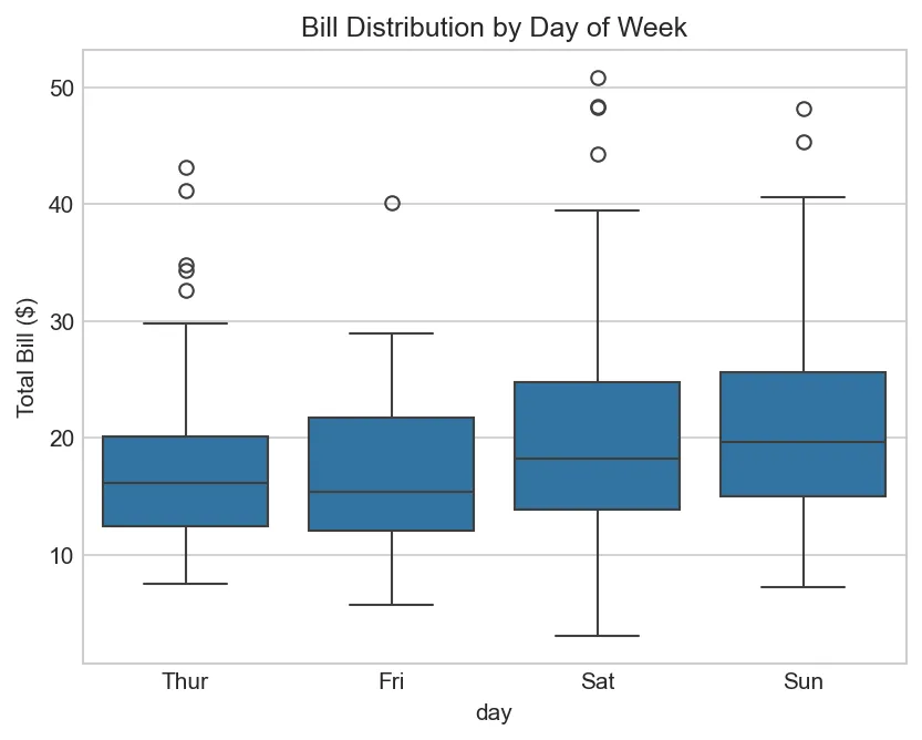
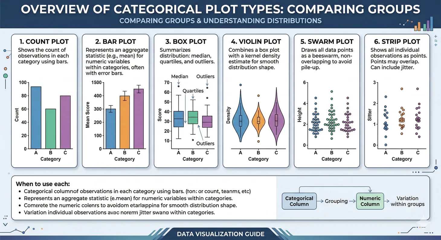
Box Plots - Detailed Parameters & Customization
boxplot() shows quartiles, median, and outliers. Essential for statistical comparison.
import matplotlib.pyplot as plt
import seaborn as sns

tips = sns.load_dataset('tips')

# Basic box plot (shows median, Q1, Q3, whiskers, outliers)
sns.boxplot(data=tips, x='day', y='total_bill')
plt.title('Bill Distribution by Day of Week')
plt.ylabel('Total Bill ($)')
plt.show()
Figure: Bill Distribution by Day of Week
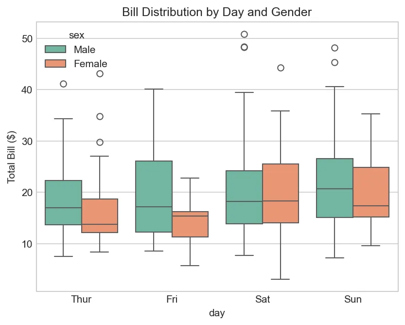
import matplotlib.pyplot as plt
import seaborn as sns

tips = sns.load_dataset('tips')

# Box plot with hue (grouping variable)
sns.boxplot(data=tips, x='day', y='total_bill', hue='sex',
            palette='Set2')          # Color palette
plt.title('Bill Distribution by Day and Gender')
plt.ylabel('Total Bill ($)')
plt.show()
Figure: Bill Distribution by Day and Gender
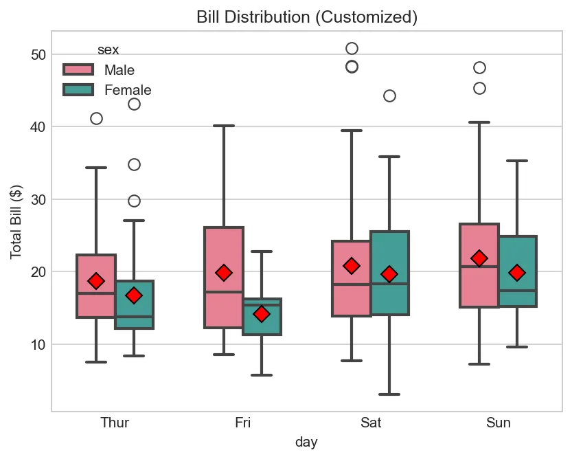
import matplotlib.pyplot as plt
import seaborn as sns

tips = sns.load_dataset('tips')

# Detailed customization
sns.boxplot(data=tips, x='day', y='total_bill', hue='sex',
            palette='husl',         # Color palette
            width=0.6,              # Box width (0-1)
            linewidth=2,            # Line thickness
            fliersize=8,            # Outlier marker size
            dodge=True,             # Separate boxes by hue
            showmeans=True,         # Show mean point
            meanprops=dict(marker='D', markerfacecolor='red',
                          markersize=8, markeredgecolor='black'))
plt.title('Bill Distribution (Customized)')
plt.ylabel('Total Bill ($)')
plt.show()
Figure: Bill Distribution (Customized)
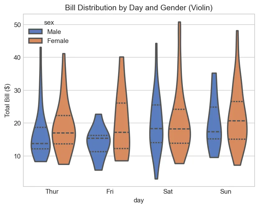
import matplotlib.pyplot as plt
import seaborn as sns

tips = sns.load_dataset('tips')

# Violin plot (box + distribution shape)
sns.violinplot(data=tips, x='day', y='total_bill', hue='sex',
               split=False,         # False=overlay, True=split (only 2 hues)
               palette='muted',     # Soft color palette
               inner='quartile',    # Shows quartiles ('box', 'point', 'stick', None)
               cut=0,               # Extend density to data range
               linewidth=2)
plt.title('Bill Distribution by Day and Gender (Violin)')
plt.ylabel('Total Bill ($)')
plt.show()
Figure: Bill Distribution by Day and Gender (Violin)
Box Plot Parameters Summary:
data: DataFrame
x, y: Column names (y is numeric for box plot)
hue: Column for grouping/coloring
palette: Color palette ('Set2', 'husl', 'pastel', etc.)
width: Box width (0-1, default 0.6)
linewidth: Border line thickness
fliersize: Outlier marker size
showmeans: Boolean to show mean point
meanprops: Dict customizing mean marker appearance
dodge: Separate boxes by hue or overlap
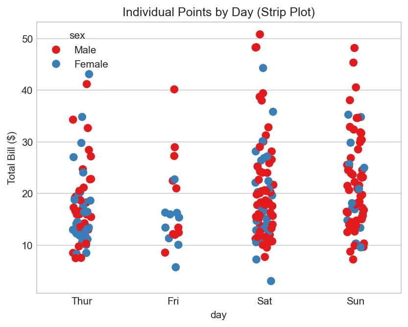
Additional Distribution Plots: Strip and Swarm
import matplotlib.pyplot as plt
import seaborn as sns

tips = sns.load_dataset('tips')

# Strip plot (scatter plot with jitter for categorical x)
sns.stripplot(data=tips, x='day', y='total_bill', hue='sex',
              size=8,               # Point size
              jitter=True,          # Add random jitter to avoid overlap
              palette='Set1')
plt.title('Individual Points by Day (Strip Plot)')
plt.ylabel('Total Bill ($)')
plt.show()
Figure: Individual Points by Day (Strip Plot)
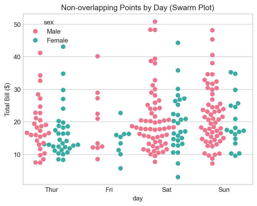
import matplotlib.pyplot as plt
import seaborn as sns

tips = sns.load_dataset('tips')

# Swarm plot (strip plot with smart separation to avoid overlap)
sns.swarmplot(data=tips, x='day', y='total_bill', hue='sex',
              size=7,               # Point size
              palette='husl',
              dodge=True)           # Separate by hue
plt.title('Non-overlapping Points by Day (Swarm Plot)')
plt.ylabel('Total Bill ($)')
plt.show()
Figure: Non-overlapping Points by Day (Swarm Plot)
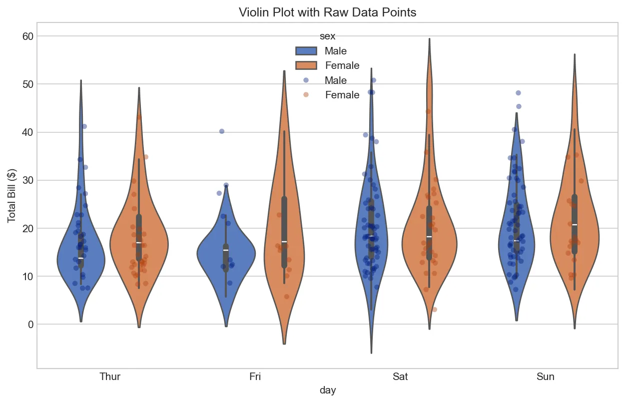
import matplotlib.pyplot as plt
import seaborn as sns

tips = sns.load_dataset('tips')

# Combine violin plot with strip plot (show distribution + raw data)
fig, ax = plt.subplots(figsize=(10, 6))

sns.violinplot(data=tips, x='day', y='total_bill', hue='sex',
               palette='muted', ax=ax)
sns.stripplot(data=tips, x='day', y='total_bill', hue='sex',
              size=5, alpha=0.4, palette='dark', dodge=True, ax=ax)

plt.title('Violin Plot with Raw Data Points')
plt.ylabel('Total Bill ($)')
plt.show()
Figure: Violin Plot with Raw Data Points
Relationships & Correlations
Scatter Plots
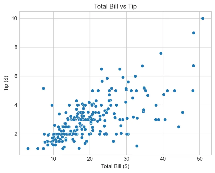
import matplotlib.pyplot as plt
import seaborn as sns

tips = sns.load_dataset('tips')

# Basic scatter
sns.scatterplot(data=tips, x='total_bill', y='tip')
plt.title('Total Bill vs Tip')
plt.xlabel('Total Bill ($)')
plt.ylabel('Tip ($)')
plt.show()
Figure: Total Bill vs Tip
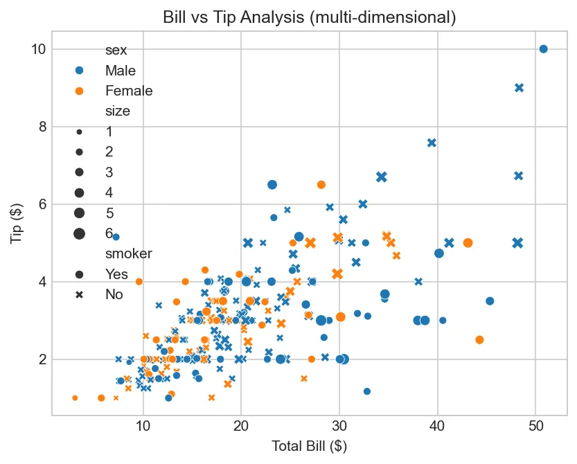
import matplotlib.pyplot as plt
import seaborn as sns

tips = sns.load_dataset('tips')

# With categories (color, style, size by different variables)
sns.scatterplot(data=tips, x='total_bill', y='tip',
                hue='sex', style='smoker', size='size')
plt.title('Bill vs Tip Analysis (multi-dimensional)')
plt.xlabel('Total Bill ($)')
plt.ylabel('Tip ($)')
plt.show()
Figure: Bill vs Tip Analysis (multi-dimensional)
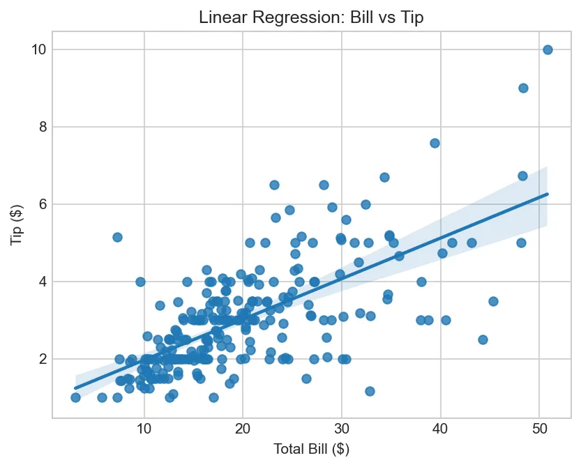
Regression Plots
import matplotlib.pyplot as plt
import seaborn as sns

tips = sns.load_dataset('tips')

# Scatter with regression line
sns.regplot(data=tips, x='total_bill', y='tip')
plt.title('Linear Regression: Bill vs Tip')
plt.xlabel('Total Bill ($)')
plt.ylabel('Tip ($)')
plt.show()
Figure: Linear Regression: Bill vs Tip
import seaborn as sns
tips = sns.load_dataset('tips')
# Linear model with confidence interval (by category)
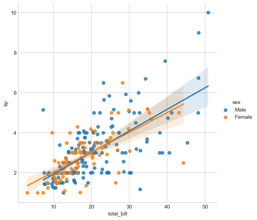
sns.lmplot(data=tips, x='total_bill', y='tip', hue='sex', height=6)
plt.show()
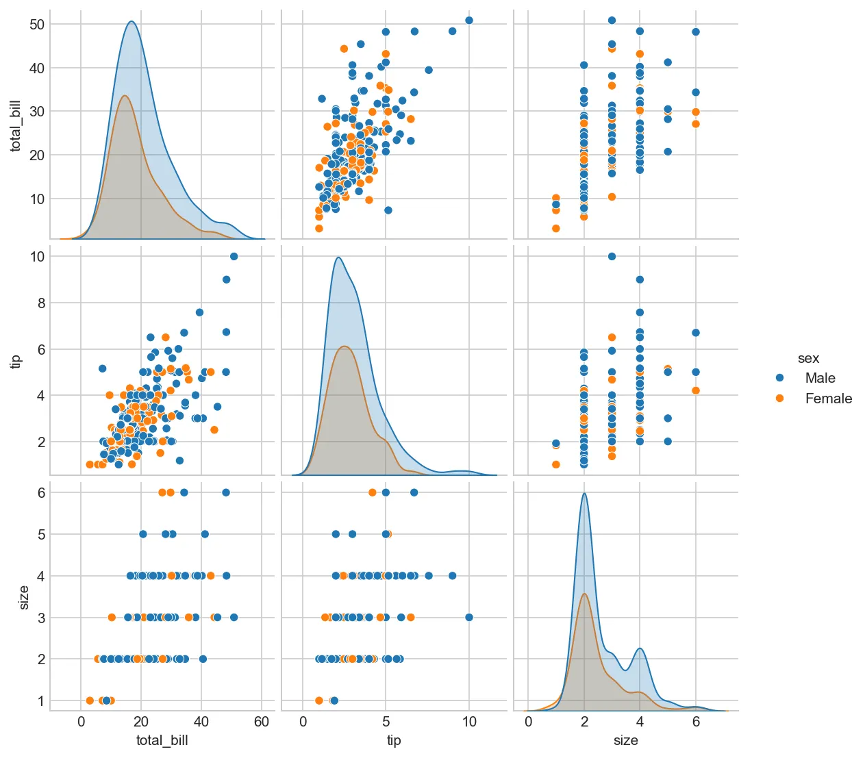
import seaborn as sns
tips = sns.load_dataset('tips')
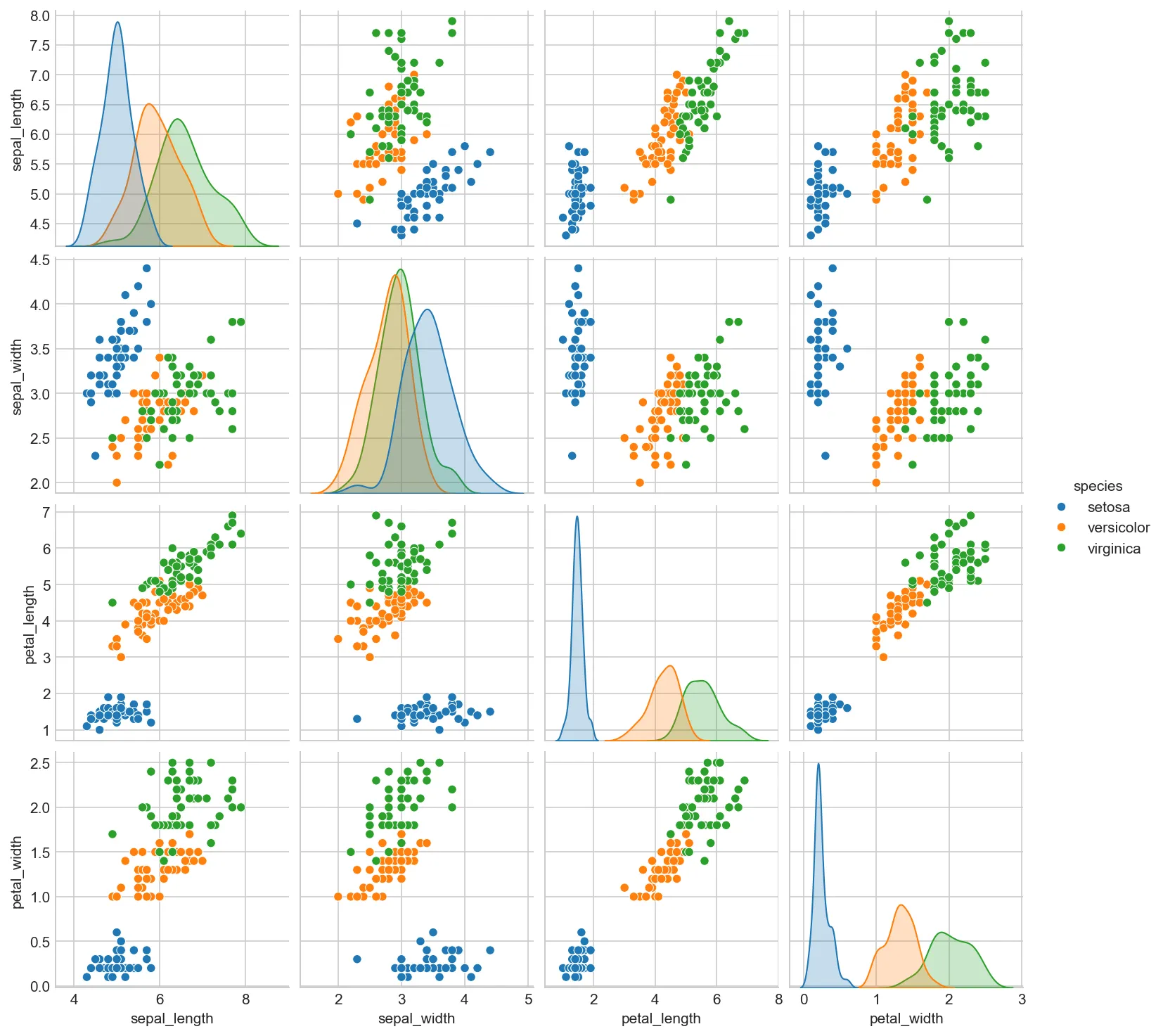
# All pairwise relationships
sns.pairplot(tips, hue='sex', diag_kind='kde')
plt.show()
Figure: Visualization Visualization
Categorical Data Plots
Figure 5: Categorical data plot types — count, bar, box, violin, swarm, and strip plots for comparing groups
Count Plots
import matplotlib.pyplot as plt
import seaborn as sns
tips = sns.load_dataset('tips')
# Count by category
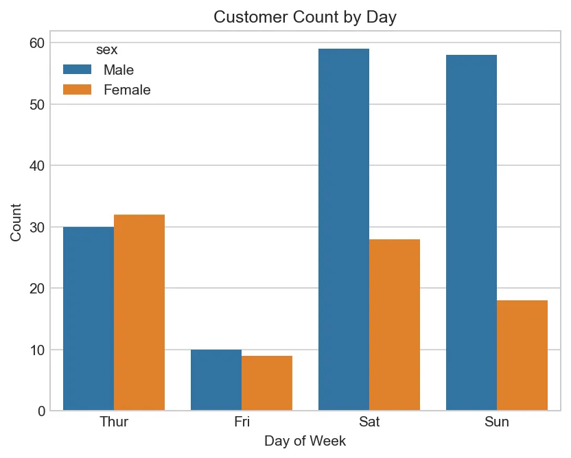
sns.countplot(data=tips, x='day', hue='sex')
plt.title('Customer Count by Day')
plt.xlabel('Day of Week')
plt.ylabel('Count')
plt.show()
Figure: Customer Count by Day
Bar Plots (with aggregation)
import matplotlib.pyplot as plt
import seaborn as sns
tips = sns.load_dataset('tips')
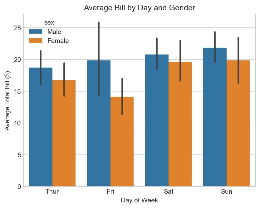
# Mean with 95% confidence interval
sns.barplot(data=tips, x='day', y='total_bill', hue='sex', ci=95)
plt.title('Average Bill by Day and Gender')
plt.xlabel('Day of Week')
plt.ylabel('Average Total Bill ($)')
plt.show()
Figure: Average Bill by Day and Gender
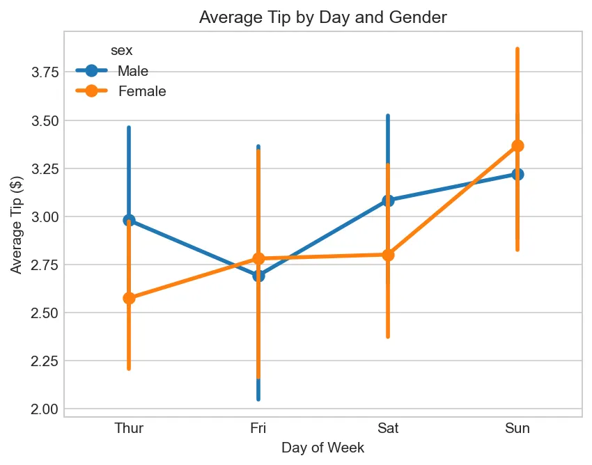
Point Plots
import matplotlib.pyplot as plt
import seaborn as sns

tips = sns.load_dataset('tips')

# Show point estimates and confidence intervals
sns.pointplot(data=tips, x='day', y='tip', hue='sex')
plt.title('Average Tip by Day and Gender')
plt.xlabel('Day of Week')
plt.ylabel('Average Tip ($)')
plt.show()
Figure: Average Tip by Day and Gender
Real-World Example
Complete Analysis Workflow
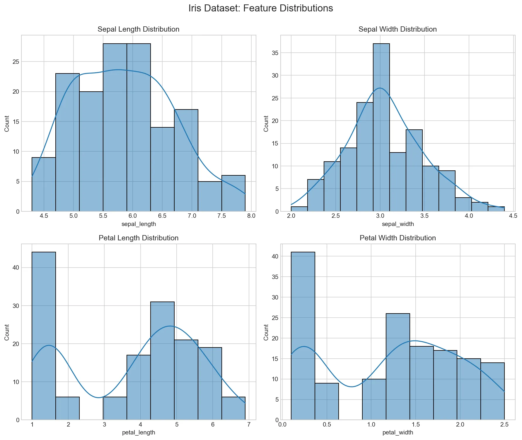
import matplotlib.pyplot as plt
import seaborn as sns

# Load data
df = sns.load_dataset('iris')

# 1. Distribution of features
fig, axes = plt.subplots(2, 2, figsize=(12, 10))

sns.histplot(df['sepal_length'], kde=True, ax=axes[0,0])
axes[0,0].set_title('Sepal Length Distribution')

sns.histplot(df['sepal_width'], kde=True, ax=axes[0,1])
axes[0,1].set_title('Sepal Width Distribution')

sns.histplot(df['petal_length'], kde=True, ax=axes[1,0])
axes[1,0].set_title('Petal Length Distribution')

sns.histplot(df['petal_width'], kde=True, ax=axes[1,1])
axes[1,1].set_title('Petal Width Distribution')

plt.suptitle('Iris Dataset: Feature Distributions', fontsize=16, y=1.00)
plt.tight_layout()
plt.show()
✅ Start axes at zero: For bar charts (avoid misleading comparisons)
When to Use What
Quick Reference
Goal
Use
Compare categories
Bar chart
Show trend over time
Line chart
Distribution shape
Histogram, KDE, violin
Outlier detection
Box plot
Relationship between variables
Scatter plot
Correlation matrix
Heatmap
Part-of-whole
Pie chart (use sparingly!)
Saving Figures
# Save as PNG (for web/presentations)
plt.savefig('figure.png', dpi=300, bbox_inches='tight')

# Save as PDF (for publications)
plt.savefig('figure.pdf', bbox_inches='tight')

# Save as SVG (vector, scalable)
plt.savefig('figure.svg', bbox_inches='tight')
Figure: Visualization Visualization
Practice Exercises
Seaborn & Advanced Visualization Exercises
Exercise 1 (Beginner): Load a Seaborn dataset (tips, iris, or flights). Create box plots, violin plots, and bar plots using hue parameter for grouping.
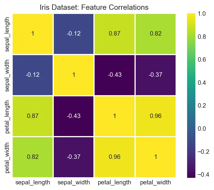
Exercise 2 (Beginner): Create a correlation heatmap from a DataFrame. Customize colormap, annotations, and layout. Experiment with different cmaps (coolwarm, viridis, RdBu).
Exercise 3 (Intermediate): Create a pairplot with a dataset. Customize diagonal plot (histogram vs KDE). Add a hue variable to show group differences. Explain what patterns emerge.
Exercise 4 (Intermediate): Create categorical plots (count, bar, point, strip). Combine Matplotlib and Seaborn styling. Use FacetGrid for multi-plot grids by category.
Challenge (Advanced): Create a complex multi-plot dashboard combining multiple Seaborn plots. Use GridSpec or figure-level functions. Save as high-quality PNG/PDF for publication.
Matplotlib & Seaborn API Cheat Sheet
Quick reference for creating compelling data visualizations in Python.
Matplotlib Basics
plt.plot(x, y)
Line plot
plt.scatter(x, y)
Scatter plot
plt.bar(x, y)
Bar chart
plt.hist(data, bins=20)
Histogram
plt.pie(sizes, labels)
Pie chart
plt.boxplot(data)
Box plot
plt.imshow(img)
Display image
plt.show()
Display figure
Customization
plt.title('Title')
Set title
plt.xlabel('X')
X-axis label
plt.ylabel('Y')
Y-axis label
plt.legend()
Show legend
plt.grid(True)
Add grid
plt.xlim(0, 10)
Set x limits
plt.ylim(0, 10)
Set y limits
color='red'
Set color
Subplots
fig, ax = plt.subplots()
Single subplot
fig, axes = plt.subplots(2,3)
2×3 grid
ax.plot(x, y)
Plot on axes
ax.set_title('Title')
Axes title
ax.set_xlabel('X')
Axes x-label
plt.tight_layout()
Auto-adjust
sharex=True
Share x-axis
figsize=(10,6)
Figure size
Seaborn Plots
sns.scatterplot(x, y, data)
Scatter plot
sns.lineplot(x, y, data)
Line plot
sns.barplot(x, y, data)
Bar plot
sns.boxplot(x, y, data)
Box plot
sns.violinplot(x, y, data)
Violin plot
sns.heatmap(data, annot=True)
Heatmap
sns.pairplot(df)
Pairwise plots
sns.regplot(x, y, data)
Regression plot
Styling
plt.style.use('ggplot')
Apply style
sns.set_theme()
Seaborn theme
sns.set_palette('husl')
Color palette
linestyle='--'
Dashed line
marker='o'
Circle markers
linewidth=2
Line thickness
alpha=0.5
Transparency
label='Data'
Legend label
Saving Figures
plt.savefig('plot.png')
Save as PNG
plt.savefig('plot.pdf')
Save as PDF
plt.savefig('plot.svg')
Save as SVG
dpi=300
High resolution
bbox_inches='tight'
Trim whitespace
transparent=True
Transparent bg
facecolor='white'
Background color
Pro Tips:
Object-oriented API: Use fig, ax = plt.subplots() for better control
Seaborn integration: Seaborn plots work with matplotlib customization
Format strings:'ro-' = red circles with solid line
Interactive mode: Use %matplotlib inline in Jupyter notebooks
Related Articles in This Series
Part 1: NumPy Foundations for Data Science
Master NumPy arrays, vectorization, broadcasting, and linear algebra operations—the foundation of Python data science.
![Format Strings: [marker][line][color]](../../../images/series/python-data-science/visualization-format-strings-marker-line-color.webp)