We use cookies to enhance your browsing experience, serve personalized content, and analyze our traffic.
By clicking "Accept All", you consent to our use of cookies. See our
Privacy Policy
for more information.
Marketing & Strategy Series Part 10: Conversion Rate Optimization (CRO)
February 12, 2026Wasil Zafar25 min read
Master landing page optimization, A/B testing methodologies, user experience design principles, and conversion funnel optimization for maximum marketing ROI.
Part 10 of 21: Building on analytics and attribution from Part 9, this article explores conversion rate optimization—the science and art of turning more visitors into customers.
Think of your website as a physical store. Traffic is people walking through the door — but if the layout is confusing, signage is unclear, and checkout lines are long, most people walk right back out. CRO is the science of redesigning the store so more browsers become buyers.
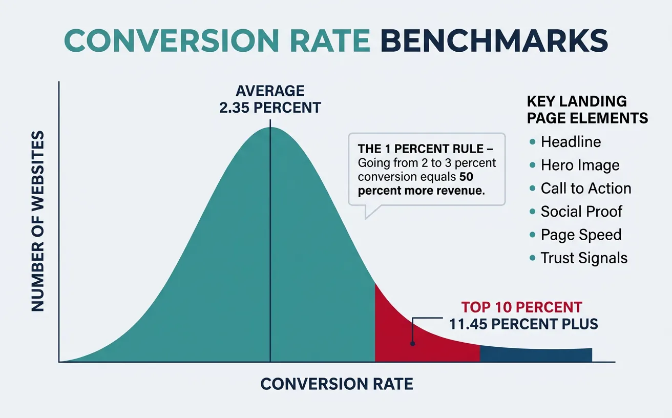
The 1% Rule: A site converting at 2% that improves to 3% hasn't improved by 1 percentage point — it has increased revenue by 50% with zero additional traffic spend. CRO is the highest-leverage marketing activity because it multiplies the value of every dollar spent on acquisition.
The average website conversion rate is 2.35%, but the top 10% of websites convert at 11.45%+ (WordStream). The gap isn't better products — it's better optimization. CRO bridges this gap through systematic testing and user-centered design.
Website conversion rate distribution: the average is 2.35%, but top 10% performers convert at 11.45%+ through systematic optimization
Landing Page Element
Best Practice
Impact on CR
Priority
Headline
Clear benefit statement, matches ad copy
+20-30% when message-matched
Critical
Hero Image/Video
Show product in use, real people preferred
+10-15% with relevant visuals
High
CTA Button
Action verb, contrasting color, above fold
+5-30% with optimized CTA
Critical
Social Proof
Testimonials with photos, logos, metrics
+12-15% with credible proof
High
Page Load Speed
Under 3 seconds; every 1s delay = -7% CR
-20% per additional second
Critical
Trust Signals
Security badges, guarantees, privacy policies
+10-20% at checkout
Medium
The Visual Hierarchy Formula (F-Pattern): Users scan web pages in an F-shaped pattern — they read the headline horizontally, scan partway down, then read a second horizontal line, then scan the left side vertically. Place your most important elements (headline, CTA, value prop) along these scan paths. Use visual weight (size, color, contrast) to guide the eye to your conversion point.
Conversion Copywriting
Great conversion copy doesn't just describe — it transforms. It takes the reader from their current state (problem, frustration, desire) to a future state (solution, relief, achievement). Every line should move the reader one step closer to the CTA.
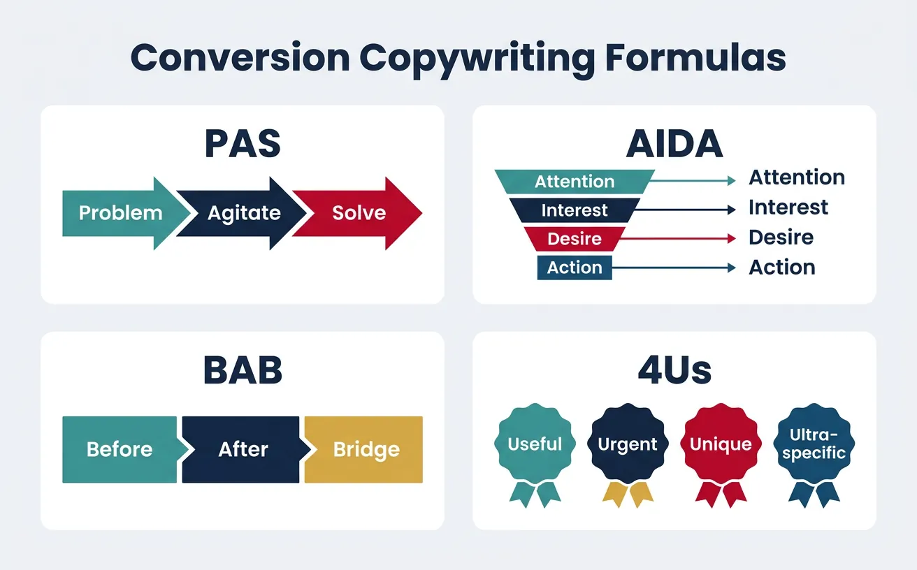
Proven conversion copy formulas: PAS (Problem-Agitate-Solve), AIDA, BAB (Before-After-Bridge), and the 4Us framework
Formula
Structure
Example
Best For
PAS
Problem → Agitate → Solve
"Losing leads? Competitors are stealing them. Our CRM captures every one."
Pain-aware audiences
AIDA
Attention → Interest → Desire → Action
"10x your leads. Here's how 500 SaaS companies did it. Free trial."
Cold traffic
BAB
Before → After → Bridge
"Manual reports took 8 hours. Now take 8 minutes. Meet AutoReport."
Solution-aware audiences
4Us
Useful, Urgent, Unique, Ultra-specific
"Get 47% more signups in 30 days — or we pay you $500."
Headlines, subject lines
So What?
Feature → Benefit → "So what?" → Deeper benefit
"AI-powered = faster answers = less waiting = happier customers = more revenue"
Feature-heavy products
Case Study: Basecamp's Homepage Rewrite
Copywriting+14% Signups
Before: "Basecamp is a project management tool that helps teams collaborate." — Feature-focused, generic, forgettable.
After: "Before Basecamp: People scattered, projects falling through the cracks. After Basecamp: Everything organized, everyone accountable." — Emotional, Before/After structure, customer-focused.
Result: The BAB rewrite increased free trial signups by 14%. The key insight: customer-focused storytelling outperforms feature lists. The homepage wasn't about Basecamp — it was about the transformation Basecamp creates in the customer's life.
Form Optimization
Form Element
Optimization Rule
Impact
Number of Fields
Reduce to essential only (3-5 fields optimal)
-25% CR per additional field (Formstack)
Multi-Step Forms
Break long forms into 3-5 steps with progress bar
+86% completion vs. single-page (Venture Harbour)
Field Labels
Top-aligned labels > side-aligned > placeholder text only
2x faster completion with top-aligned
Inline Validation
Real-time error checking as user types
+22% completion (Baymard Institute)
Smart Defaults
Pre-fill country, currency; auto-detect from IP
-15-20% form drop-off
Social/SSO Login
Offer Google, Apple, LinkedIn sign-in
+20-50% registration (Web.dev)
Progressive Profiling Rule: Never ask for all information upfront. Collect email first, then progressively ask for company name, role, phone number over the next 3-5 interactions. HubSpot found that progressive profiling increases lead-to-MQL conversion by 20% by reducing initial form friction while still collecting complete data over time.
Testing & Experimentation
A/B Testing
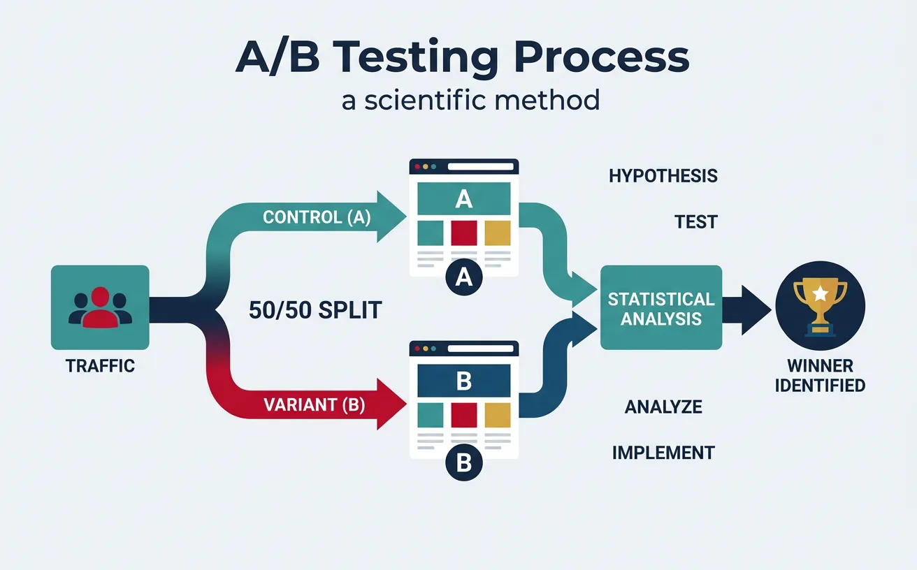
A/B testing is the scientific method applied to marketing. Just as a pharmaceutical company wouldn't release a drug without clinical trials, you shouldn't launch a page change without testing it against the original. One version serves as the control (A), the other as the variant (B), and traffic splits evenly between them.
A/B testing splits traffic between control (A) and variant (B), using statistical analysis to identify the winning version
Test Component
What to Test
Typical Lift Range
Required Sample Size
Headlines
Benefit vs. feature, length, specificity
10-30%
~2,500 conversions per variant
CTA Copy
"Start Free Trial" vs. "Get Started Free"
5-25%
~1,500 conversions per variant
Page Layout
Long-form vs. short-form, element order
15-50%
~3,000 conversions per variant
Social Proof
Testimonials vs. logos vs. case studies
5-15%
~2,000 conversions per variant
Pricing Display
Monthly vs. annual, anchor pricing
10-40%
~5,000 conversions per variant
Images/Video
Product shots vs. lifestyle vs. video
5-20%
~2,000 conversions per variant
Sample Size Formula: Before running any test, calculate the required sample size. For a baseline CR of 3%, detecting a 10% relative lift (to 3.3%) at 95% confidence and 80% power requires approximately 35,000 visitors per variant. Tools like Evan Miller's calculator or Optimizely's Stats Engine automate this. Never call a test early — "peeking" inflates false positive rates from 5% to 26% (Optimizely research).
Case Study: Booking.com's Testing Machine
A/B Testing25,000+ Tests/Year
Scale: Booking.com runs more than 25,000 concurrent A/B tests at any time — the largest known testing program in the world. Every employee can run tests without approval.
Process: Tests are auto-evaluated at pre-set confidence levels. Winners are automatically deployed. Failed tests are documented with learnings. The system tracks dozens of KPIs per test, not just the primary metric, to catch negative side effects.
Key Design: They use server-side testing exclusively — no flickering, no client-side delays. Each test is isolated to prevent interaction effects. Their culture treats every change as a hypothesis, never a certainty.
Result: This relentless testing culture helped Booking.com grow from a Dutch startup to a $100B+ market cap company. They estimate testing generates hundreds of millions in incremental annual revenue.
Multivariate Testing
While A/B testing compares two complete versions, multivariate testing (MVT) examines the interaction effects between multiple elements simultaneously. Think of it as testing a recipe — A/B testing changes the whole recipe, MVT changes individual ingredients to find the perfect combination.
Factor
A/B Testing
Multivariate (MVT)
Bandit Testing
What's Tested
Full page variants
Element combinations
Multiple variants with dynamic allocation
Traffic Needed
Low-Medium
Very High (exponential)
Medium
Insights
"Which version wins"
"Which elements interact"
"Which variant performs best right now"
Best For
Major redesigns, low-traffic sites
High-traffic sites, landing pages
Time-sensitive campaigns, optimization
Duration
2-4 weeks
4-8 weeks
Continuous (auto-adapts)
Personalization Testing
Personalization is segmented CRO at scale. Instead of finding one page that works best for everyone, you serve different experiences to different segments. Amazon attributes 35% of its revenue to personalization recommendations.
Personalization Level
Data Used
Example
Complexity
Rule-Based
Location, device, referral source
Show local phone number by geo-IP
Low
Segment-Based
Industry, company size, behavior
Enterprise vs. SMB pricing display
Medium
Behavioral
Past visits, pages viewed, actions
Return visitor sees "Welcome back" + new content
Medium-High
Predictive (AI)
ML models on all signals combined
Netflix-style "Recommended for you" product grid
High
UX & Persuasion Design
User Research for CRO
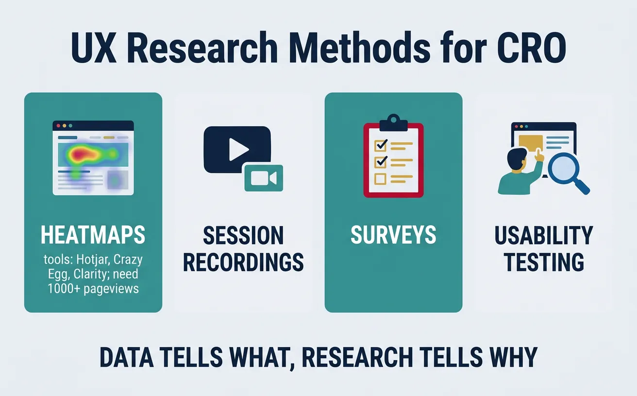
Data tells you what is happening. User research tells you why. Without qualitative research, CRO becomes random guessing — you can see that 70% of visitors leave your pricing page, but only user research reveals whether they're confused by the tiers, shocked by the price, or simply can't find the buy button.
The CRO research toolkit: heatmaps, session recordings, surveys, and usability testing reveal why users don't convert
Research Method
What It Reveals
Tools
Sample Size
Heatmaps
Where users click, scroll, and hover
Hotjar, Crazy Egg, Microsoft Clarity
1,000+ pageviews
Session Recordings
Actual user behavior, frustration signals
Hotjar, FullStory, LogRocket
50-100 recordings
User Surveys
Self-reported barriers, motivations, objections
Hotjar, Qualaroo, SurveyMonkey
100-300 responses
Usability Testing
Task completion rates, navigation issues
UserTesting, Maze, Lookback
5-8 participants reveal 85% of issues
Exit Intent Surveys
Why visitors leave without converting
OptinMonster, Hotjar, Qualaroo
200+ responses
Case Study: Unbounce's CRO Research Process
User Research+30% Trial Starts
Challenge: Unbounce noticed that their free trial signup page had strong traffic but mediocre conversion. Analytics showed a 68% bounce rate but couldn't explain why.
Research Stack: They deployed a 3-layer research approach: (1) Heatmaps revealed that only 15% of visitors scrolled past the hero section — the CTA was below the fold for most devices. (2) Session recordings showed users hovering over pricing but not clicking — confusion about what "free trial" included. (3) Exit surveys revealed the #1 objection: "I'm not sure this will work with my existing tools."
Action: They moved the CTA above the fold, added "No credit card required" microtext, and placed an integration logos bar directly under the CTA.
Result: Trial signups increased by 30%. The research took 2 weeks; the implementation took 2 days. The lesson: 20 minutes of watching real users > 20 hours of guessing.
Persuasion Psychology
CRO without psychology is just rearranging furniture. Understanding why people say yes transforms optimization from cosmetic tweaks to systematic persuasion architecture.
Principle
Psychology
CRO Application
Example
Social Proof
People follow the crowd in uncertainty
Customer count, testimonials, ratings
"Join 50,000+ marketers" (Mailchimp)
Scarcity
Limited availability increases perceived value
Countdown timers, limited seats, stock levels
"Only 3 seats left at this price" (Booking.com)
Anchoring
First number seen shapes all subsequent judgments
Show higher price first, then discounted price
"Was $299/mo → Now $99/mo" (crossed out original)
Loss Aversion
Losses are felt 2x more than equivalent gains
Frame features as "don't lose" not "you'll gain"
"Don't let another lead slip away" vs. "Get more leads"
Reciprocity
People feel obligated to return favors
Free tools, calculators, templates before asking
HubSpot's free CRM → paid Marketing Hub upsell
Default Effect
People stick with pre-selected options
Pre-select recommended plan, annual billing
"Most Popular" badge on middle pricing tier
Mobile CRO
Mobile accounts for 60%+ of web traffic but converts at roughly half the rate of desktop (1.53% vs. 3.90% — Monetate). This conversion gap represents the single largest CRO opportunity for most businesses.
The Thumb Zone Rule: On mobile, design for one-handed use. The most important interactive elements (CTA button, navigation, search) should be within the natural thumb reach zone — the bottom-center 60% of the screen. Elements in the top corners require a grip change and see 75% lower interaction rates. Sticky CTAs at the bottom of the screen consistently outperform top-placed CTAs on mobile by 20-30%.
Mobile CRO Factor
Desktop Approach
Mobile Optimization
Impact
Forms
Side-by-side fields
Single-column, large tap targets (44px+)
+20-40% completion
Navigation
Full menu bar
Hamburger + bottom tab bar
+15% engagement
CTAs
Inline buttons
Sticky bottom CTA bar
+25-30% click rate
Checkout
Multi-page forms
Apple Pay, Google Pay one-tap
+35% checkout completion
Content
Long paragraphs
Scannable bullets, accordions, tabs
+20% scroll depth
Funnel Optimization
Checkout Optimization
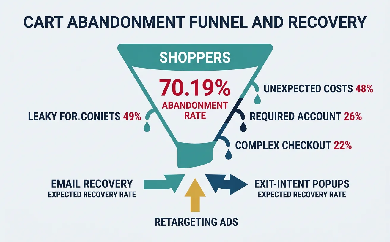
Cart abandonment averages 70.19% across all industries (Baymard Institute) — meaning for every 10 shoppers who add items to their cart, only 3 complete the purchase. The checkout is where money literally walks out the door.
Cart abandonment at 70.19%: unexpected costs (48%), required account creation (26%), and complex checkout (22%) are the top conversion killers
Challenge: ASOS (£3.9B revenue) had a 75% cart abandonment rate on mobile — significantly above desktop. Mobile was their fastest-growing channel but worst-converting.
Changes: (1) Reduced checkout from 5 pages to a single scrollable page. (2) Added Apple Pay and Google Pay — reducing payment to one tap. (3) Implemented saved addresses and payment methods for returning customers. (4) Added visual progress indicator showing 3 simple steps. (5) Showed "Free delivery over £40" message dynamically with running total.
Result: Mobile checkout conversion increased by 50%. The average checkout time dropped from 3 minutes 20 seconds to 1 minute 15 seconds. Key insight: every eliminated click in mobile checkout is worth 2-3% conversion improvement.
Friction Analysis
Friction is anything that makes the user pause, think, or hesitate. Good CRO identifies and eliminates friction systematically — like a plumber finding and fixing leaks in a pipe.
The PIE Prioritization Framework: Score every test idea on three criteria (1-10 each):
P — Potential: How much improvement can this test make? (based on data, not gut feeling)
I — Importance: How valuable is this page/element? (traffic volume × revenue impact)
E — Ease: How easy is this to implement and test? (dev time, design resources, risk)
Total PIE Score = (P + I + E) / 3. Run tests with highest PIE scores first. This prevents the common CRO mistake of testing button colors when the headline is broken.
CRO Maturity Level
Testing Volume
Team Structure
Revenue Impact
Level 1: Ad Hoc
1-2 tests/month
Marketing team runs occasional tests
2-5% CR improvement/year
Level 2: Systematic
4-8 tests/month
Dedicated CRO analyst + designer
10-20% CR improvement/year
Level 3: Programmatic
15-30 tests/month
CRO team (analyst, UX, dev, copywriter)
25-50% CR improvement/year
Level 4: Culture
50+ tests/month
Embedded across every team (Booking.com model)
Continuous compounding improvement
Tools & Practice
CRO Audit Canvas
Use this canvas to audit your conversion optimization. Download as Word, Excel, PDF, or PowerPoint for your CRO toolkit.
CRO Audit Canvas
Audit your conversion optimization strategy. Download as Word, Excel, PDF, or PowerPoint.
Draft auto-saved
All data stays in your browser. Nothing is sent to or stored on any server.
Practice Exercises
Exercise 1: Landing Page Audit
Pick any SaaS signup page and evaluate it against the 6-element landing page framework:
Headline: Does it state a clear benefit and match the traffic source?
Hero: Does the image/video show the product in use?
CTA: Is it above the fold with a contrasting color and action verb?
Social proof: Are there credible testimonials with names, photos, and metrics?
Speed: Does it load under 3 seconds (test with PageSpeed Insights)?
Trust: Are there security badges, guarantees, and privacy links?
Score each element 1-10 and propose 3 test hypotheses based on weakest areas.
Exercise 2: A/B Test Design
Design a complete A/B test for a pricing page with a current conversion rate of 2.1% and 50,000 monthly visitors:
State your hypothesis using "If we [change], then [metric] will [increase/decrease] because [reason]"
Calculate the required sample size for detecting a 15% relative lift at 95% confidence
Determine test duration and traffic split
Define primary metric (CR) and guardrail metrics (revenue per visitor, bounce rate)
Write analysis plan: What result stops the test? How will you handle inconclusive results?
Exercise 3: Friction Mapping
Map the friction points in an e-commerce checkout flow from cart to confirmation:
List every step and decision the user must make
Classify each friction point: cognitive, emotional, technical, or process
Assign a PIE score to each friction point
Design 3 specific fixes for the top-scored friction points
Estimate the expected conversion improvement for each fix
Key Takeaways
CRO multiplies everything — a 1% CR improvement has the same revenue impact as increasing traffic by 50%. Test before you spend
Message match is conversion foundation — your landing page headline must mirror the promise in the ad, email, or link that brought the visitor
Every extra form field costs conversions — reduce to 3-5 fields, use progressive profiling for the rest
Never call a test early — "peeking" at results inflates false positive rates from 5% to 26%. Calculate sample size before launching
Research before testing — 20 minutes of session recordings reveals more than 20 hours of guessing what to test
Mobile is a different channel, not a smaller screen — design for thumb zones, one-tap payments, and sticky CTAs
70% of carts are abandoned — unexpected costs, forced account creation, and complex checkout are the top killers
Use PIE to prioritize — test ideas with the highest Potential × Importance × Ease scores first, not the most exciting ones
Continue the Series
Part 9: Analytics, Attribution & Marketing Science
Master funnel analytics and attribution for data-driven optimization.